posted
I love the art piece. What progs did you use to create it? Do you hang at Deviantart much?
Am I asking too many questions?
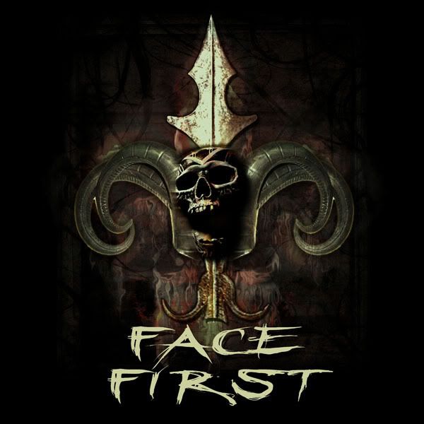
Now my one critique....the band name feels tacked on, as in an afterthought. The words deserve to be better incorporated into the great artwork above it.
posted
I have to agree with Barry. The artwork is first rate! The text doesn't seem to be part of the overall peice, although I have no real suggestions on how to fix it.
posted
absolutely agreed about the name. the text really isnt a part of it. they wanted to keep changing the font, so the finishing touches just arent there. to be honest i got tired of looking at it :] but i was pretty inspired for a minute.
on a side note... its really intimidating to post anything on here. there are soooo many talents on this site, i was shocked that anyone even responded. so thanks...fer real and stuffs :]
posted
That is amazing. Can you post other stuff. I am sure everyone would love to see more!
Thanks for posting!
-------------------- Charles Borges de Oliveira Borges Lettering & Design Snohomish WA Posts: 352 | From: Snohomish WA | Registered: Mar 2003
| IP: Logged |
posted
Wow that's is awesome!!!!! Great work!! Love to see more!!!!! Lovin it!!!! Hey don't feel intimidated. Everyone on here are awesome and very talented on what they do!! It's great to see the different talent and they help out so much on layouts and ideas!! I feel the smae way but I'm coming out of my shell a bit more everyday. One of these days when I have time I will have to post some of my stuff. Again, Awesome work!!
-------------------- Pam Edmunds Just For You Signs & Design 64 Bruce Road 17 Tara, Ontario Posts: 68 | From: Tara, Ontario | Registered: May 2008
| IP: Logged |
posted
I think you really did a nice job, Sarah. There's pattern and texture but it's not overdone. Lots of raw emotion comes across.
Like others have said, not diggin' the font. You could maybe have incorporated a metal-looking raised panel underneath and put the name in it, using a (gasp!) Blackletter typestyle. I never recommend those. Or even use the font you chose but make it appear to be "stamped" into the metal panel.
Don't be afraid to post your work, it's refreshing to see. Believe it or not, some of us are afraid to critique others' stuff! Love....Jill
Posts: 8834 | From: Butler, PA, USA | Registered: Jan 2001
| IP: Logged |
posted
when the artwork gets that creepy, the font needs to get creepy too.
at www.myfonts.com search for a font called graveblade. Something in this vein will take this design to the finish line. But don't make it look tacked on as it does now.
I've got a couple of creepy fonts on the front page of my own website, but I'm not sure they will fill the bill. You need a condensed "metal band" look or a narrow scrawl font rather than a horizontal scrawl font. Keyword searches at myfonts will help.
If you find a font, keep us posted
-------------------- Michael Gene Adkins The Fontry 1576 S Hwy 59 Watts OK 74964 Posts: 845 | From: Watts, OK USA | Registered: Jun 1999
| IP: Logged |


![[Cool]](cool.gif)
![[Big Grin]](biggrin.gif)
![[Wink]](wink.gif)


 Printer-friendly view of this topic