posted February 27, 2008 05:53 PM
Hey Adam, This looks baddass... Now all you need to do is sling a bunch of mud on it by takin' it boggin' around that pond...
-------------------- Larry Ware Warehouse 360 Studios LLC Washington DC - Savannah, GA Posts: 53 | From: Washington, DC | Registered: Feb 2007
| IP: Logged |
posted February 27, 2008 06:48 PM
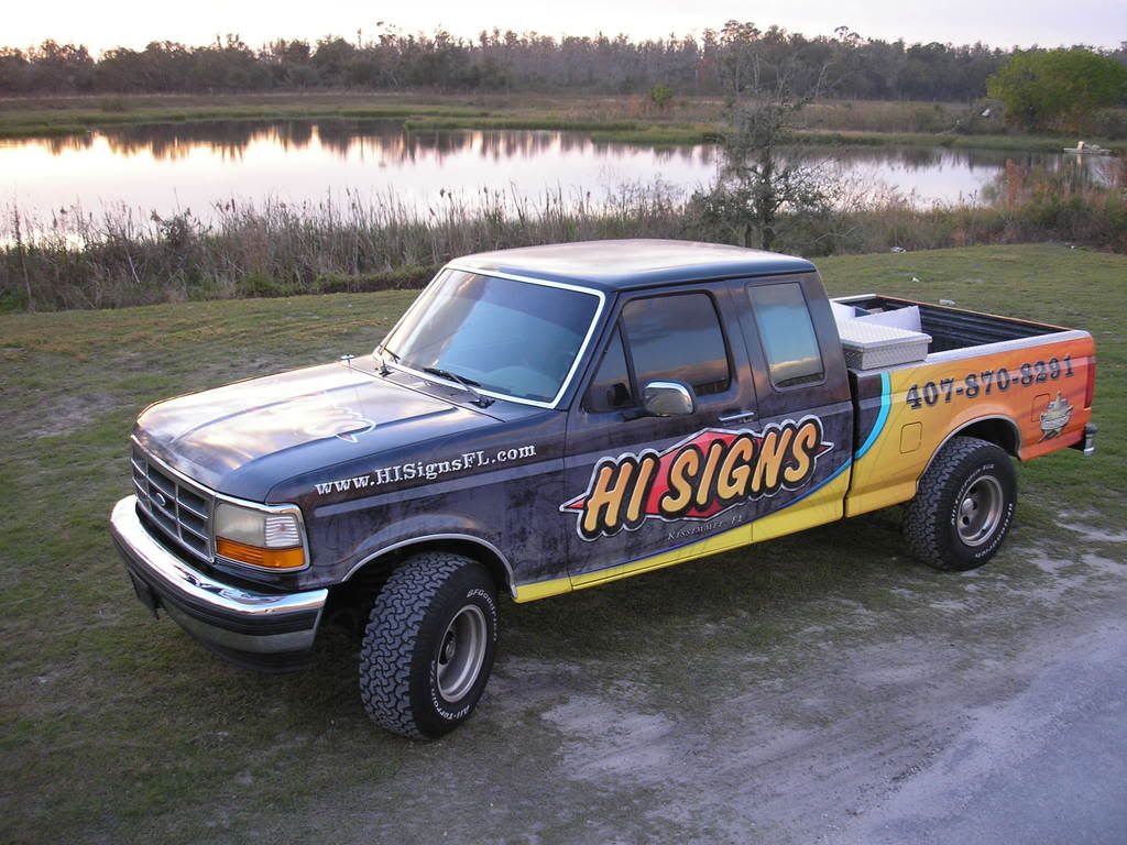
OK, at the risk of making a fool out of myself, what is the deal with the blue on the truck? Is that a special effect that just doesn't photograph well?
-------------------- George Perkins Millington,TN. goatwell@bigriver.net
"I started out with nothing and still have most of it left"
posted February 27, 2008 10:17 PM
Nice work Adam....
I'm with Larry, let's go mud riding!
-------------------- Ryan Culbertson The Sign Shop at Quick Copies Greenwood, SC
Rock and Roll means well, but it can’t help tellin’ young boys lies. Mike Cooley - Drive By Truckers Posts: 453 | From: Greenwood, South Carolina | Registered: Apr 2007
| IP: Logged |
posted February 28, 2008 10:17 AM
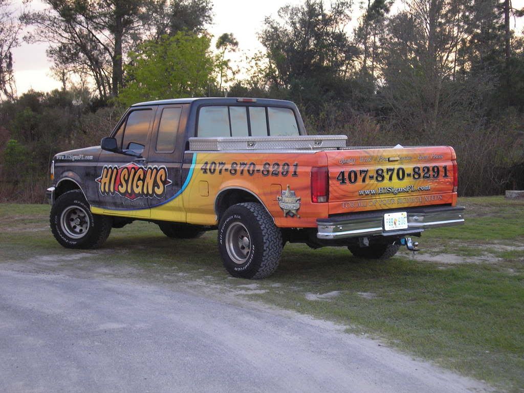
George, the onyl blue on the truck is the stripe to seperate the black/grey and yellow colors. Is this what you are asking about?
posted February 28, 2008 10:58 AM
No, I was referring to the front half of the truck, the black/gray. It looked blue to me. I know it's some sort of design it's just not clear at all in the photos.
-------------------- George Perkins Millington,TN. goatwell@bigriver.net
"I started out with nothing and still have most of it left"
posted February 28, 2008 01:26 PM
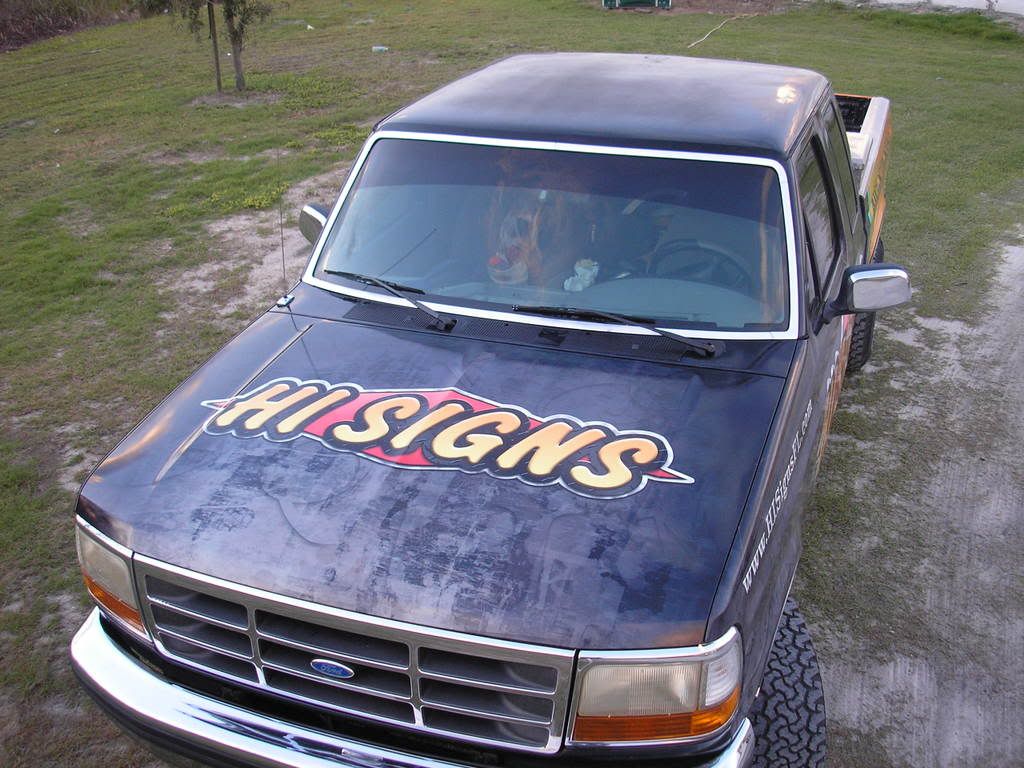
Adam, I think it looks good. Very clear & easy to read. I like the grungy texture on the front of the truck/hood area. Did you create that yourself, or was it purchased, and if so where from?
By the way- is that a letter "Q" in the hood right between "HI" and "SIGNS" ?
-------------------- Chris O'Brien Cape Cod, MA Posts: 183 | From: Cape Cod MA | Registered: Jan 2005
| IP: Logged |
posted February 29, 2008 01:00 PM
Looks good... but isn't "HI SIGNS and misdemeanors" an impeachable offense under the U.S. constitution?
I have a soon to be retired Ford truck of similar vintage that would require more than what you've done for an augmented appearance adjustment. Mine would also need the span·a·dent wrap.
-------------------- David Harding A Sign of Excellence Carrollton, TX Posts: 5084 | From: Carrollton, TX, USA | Registered: Nov 1998
| IP: Logged |
posted March 04, 2008 11:28 AM
I created all of the textures/patterns in the background. The only "purchased" fills are in the logo and lettering. The grunge effect is very easy to reproduce. Download the brushes and follow the instructions here. And, yes that is a "Q". We through a bunch of letters in the background for some added dimension. It's very subtle, and I agree kinda cheesy.
Don't misunderstand this, but IMHO, I think the backround gives a weathered look to the whole truck, almost as if the clear coat was peeling off. Probably just me, but it just looks out of place on that older body style.
I'm sure the pics don't do it justice. Rapid
-------------------- Ray Rheaume Rapidfire Design 543 Brushwood Road North Haverhill, NH 03774 rapidfiredesign@hotmail.com 603-787-6803
I like my paint shaken, not stirred. Posts: 5648 | From: North Haverhill, New Hampshire | Registered: Apr 2003
| IP: Logged |
posted March 05, 2008 10:47 AM
I see ALOT of trucks with that look around here.....after the car wash it looks alot better! I think the yellow fade to orange is good...I agree with Rabid
-------------------- Mike Meyer Sign Painter 189 1st Ave n P.O. Box 3 Mazeppa, Mn 55956
We are not selling, we are staying here in Mazeppa....we cannot re-create what we have here....not in another lifetime! SO Here we are!!!!!!!


 Printer-friendly view of this topic