posted
Ok... so I got bashed about the ears to do my own samples...lol.
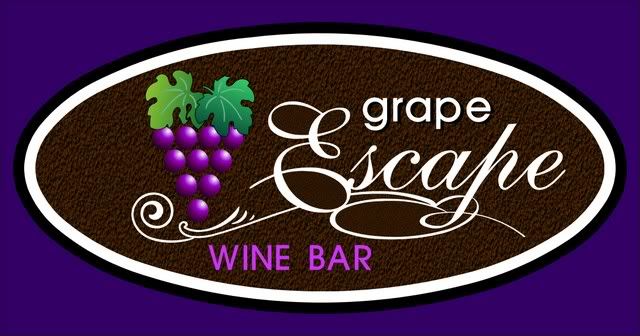
So I am after a few opinions... right track, wrong track. Would this make a good dimensional sign for sample purposes. I have tried to "dimensionalise" as much as possible. All components would be raised from surface excepting "Wine Bar", which will be engraved.
Appreciate any feedback.
-------------------- Gregg Sydney Signworks (02) 9837 1198 Schofields NSW Australia Posts: 368 | From: Schofields | Registered: May 2007
| IP: Logged |
posted
It just doesn't flow. It looks more like a computer designed it. The flurshes compete with the script lettering.(ugly "P") The grape looks out of place and too bold. The wine bar looks off center. The white border looks cheap. It would look better if the border were stretched a bit (thicker on the sides and thinner on the top and bottom) All components should be raised. But other than that if fine!
-------------------- John Arnott El Cajon CA 619 596-9989 signgraphics1@aol.com http://www.signgraphics1.com Posts: 1443 | From: El Cajon CA usa | Registered: Dec 1998
| IP: Logged |
Try rotating the grape cluster off from straight vertical, perhaps about 25 degrees Counter clockwise. I am also troubled by the helvetica lower case "grape". Tighten the word "grape" into the script copy a little bit so they become one element on the sign. I like the changes Jon has suggested. Your willingness to look at your project critically now will provide you with a very nice presentation piece when it is completed.
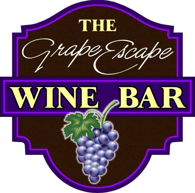
Her is something that just popped into my head. What "if" you added the word "The" to the name?????
A playoff of the old movie " The Great Escape"?
look up an old poster of the movie, and play with the type based on the movie theme??
Keep going.
Regards, Bob C.
[ June 17, 2007, 08:25 AM: Message edited by: Robert Cole ]
-------------------- Bob Cole American Sign Company 14163 Akron Canfield Rd. Berlin Center, Ohio 44401
A.K.A. Vinylman® Posts: 575 | From: Berlin Center, Ohio, USA | Registered: Nov 1998
| IP: Logged |
posted
...Alot of problems here. The negative space on the left side makes it right heavy, The lowercase vs. upper doesn't work. Is the name "Grape Escape" or just "Escape". The illustartion looks like clip art, and dominates too much. The white border is inconsistent and looks 'computerized'. The line doesn't do or help much. ...To fix things, make the name the first and clearest message. I'd change it to all script, the same size for both words. Reduce the graphic to be small and centered at the top. Pull all graphics away from the border, and strive to have consistent negative space all around w. a tad more on the bottom. Thicken up the line, level it and render it in purple. Use the same color for the border and eliminate the thin parts. Use a wider letterstyle for the 'wine bar' copy. ...And (most importantly) get a copy of 'MASTERING LAYOUT' by Mike Stevens, and read it.
posted
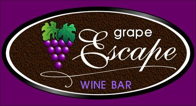
Here's my take/tweek on what's already there and what's been mentioned.
Made the "E" unsquished looking, flipped a "c" to finish the "p", slightly tilted grapes to break the oval and let a few escape, re-sized and moved stuff to ballance spacial issues a bit.
Still needs some more tweeking but I haven't had my second cup of coffe yet.
-------------------- Compulsive, Neurotic, Anti-social and Paranoid ... but basically Happy Posts: 2677 | From: Rochester, NY, USA | Registered: Nov 1998
| IP: Logged |
posted
Try doing your own script instead of picking a boring one off the computer like commercial script! It would give a nice personnal touch to the whole layout.
posted
I'd tighten up the lettering a bit to give more negative space around it. All raised it will and dimensional it will make a nice demo piece... and look you are learning plenty already!!
I know I do with every piece I do... especially when I post it here and ask for comments.
Always learning in Yarrow...
-grampa dan
-------------------- Dan Sawatzky Imagination Corporation Yarrow, British Columbia dan@imaginationcorporation.com http://www.imaginationcorporation.com
Being a grampa is one of the the most wonderful things in the world!!! Posts: 8738 | From: Yarrow, B.C. Canada | Registered: Nov 1998
| IP: Logged |
posted
Thanks so much to all... you frustrate the hell out of me... but that's what I both want and need...lol. I decided to REALLY look at what I had done, and I can certainly see where y'all are coming from. So I took a different approach. No doubt, I will probably keep going on it but I am sure you all know about improving. YES !!!! it looks computer generated, but that's the process that I go through. It's a brain thing.
-------------------- Gregg Sydney Signworks (02) 9837 1198 Schofields NSW Australia Posts: 368 | From: Schofields | Registered: May 2007
| IP: Logged |
posted
I don't mind what the first version was becoming, but I do not like the loop on the bottom of the uppercase E of Escape- it runs off in a different direction from all other spaces, for no special reason, IMHO.
You can do a lot with an E like that- maybe make the loops so big that the word 'grape' fits right inside the loop on the top of the E, and the bottom loop can nearly hit the left side of the outline oval.
-------------------- "Stewey" on chat
"...there are no limits when you aim for perfection..." Jonathan Livingston Seagull Posts: 7014 | From: Highgrove via Toowoomba, Queensland, Australia | Registered: Dec 2002
| IP: Logged |
posted
Here's another thought: it seems that you have started with an oval and then tried to make everything fit inside that shape....and it's not working very well.
My suggestion is that you layout the copy and graphics and then form the shape around them. Let the problem design the solution.
To me, the priority copy is "Wine Bar" with "Grape Escape" being secondary to that. The grape cluster is just a added pictorial that enhances the character of the design.
Several have mentioned that your layout is stiff and mechanical looking. The grapes are all uniform in size and arranged in rows. Take your inspiration from a photo of a grape cluster or use clip art that has a more natural look.
Rather than starting on the computer, begin doodling with a pencil. Here's how I approach something like you are trying to do.
Rather than worrying about font styles and color, begin with major thought groups. Each thought group should be the same letter style, color, etc.
I just noticed that I left out the word "The", so that should be part of "Grape Escape" rather than a separate thought.
Put similar thoughts together into one panel or area and then separate that thought from the others by using a different type, color, or texture.
Your computer can't see anything, so it can't design. It's only a tool that your brain uses to put your own creativity onto paper.
Good luck....keep drawing.
[ June 18, 2007, 10:01 AM: Message edited by: Raymond Chapman ]
-------------------- Chapman Sign Studio Temple, Texas chapmanstudio@sbcglobal.net Posts: 6306 | From: Temple, Texas, USA | Registered: Nov 1998
| IP: Logged |
"Scriptina", although free and full of flourish, is WAY too hard to read for most sign designs.
I can see where you're trying to get the word "Escape" in a script, but it seems like you're trying to hard to make it fancy. A simpler script would fit just as well and not fight the rest of the layout. A nice serif font like Tiffany might fit, too.
If you really want to bump it up, black smalts would really look nice for a backround texture.
Rapid
-------------------- Ray Rheaume Rapidfire Design 543 Brushwood Road North Haverhill, NH 03774 rapidfiredesign@hotmail.com 603-787-6803
I like my paint shaken, not stirred. Posts: 5648 | From: North Haverhill, New Hampshire | Registered: Apr 2003
| IP: Logged |
posted
Looking good. I would only suggest that you rotate the grape bunch a little. It looks too rigid to me. About 15 degrees clockwise for a start and see how it looks.
-------------------- Joe Abner Talisman Signs Middleboro, MA
"We are limited only by our perception of our abilities." Posts: 445 | From: Middleboro, Ma USA | Registered: Dec 2000
| IP: Logged |
posted
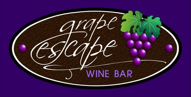
Gregg - definately take your cue's from Raymond's layout....he has layed the sign out in a legible and visually pleasing way...
And ditto to the comments about trashing the script font you are using and coming up with a new one which will read better....your last one still isn't making it.
As far as the "grapes" go.....I also concur with the comments that you need to get the grapes to look more like a random bunch....right now they look like pool balls cued up and ready for a game.
I whipped this out in Adobe Illustrator....CorelDraw has similar functions....
Bingo, buddy! You've got a winner there....nice presentation.
Watch the inner letter kerning - there are some spacing problems in "wine bar" between the letters - but other than that I'd say you have a perfect presentation.
Nice job, and thanks for taking the constructive criticism with such a positive attitude! Have a great day and much success to you.
-------------------- Todd Gill Outside The Lines Potterville, MI Posts: 7792 | From: Potterville, MI | Registered: Dec 2001
| IP: Logged |
posted
Gregg - looks much better and easier to read. Now, just refine the details. Squink and see if your eye tells you where the trouble spots are.
I would suggest that you make the word "The" a sans serif type (like Futura Light) and the same color as Grape Escape. Now, it reads as a separate thought rather than being associated with Grape Escape.
Also, tighten the space between Wine and Bar, even if the lettering goes under the grape vine.
There are some other "picky" things, but they are more personal style than glaring layout errors. I would make the grape cluster smaller and not have as much negative space around the grapes.
You're on the right path.
-------------------- Chapman Sign Studio Temple, Texas chapmanstudio@sbcglobal.net Posts: 6306 | From: Temple, Texas, USA | Registered: Nov 1998
| IP: Logged |
posted
VERY nice! There are some good suggestions on improving it further, but I feel the E of escape needs a bit of attention- it's too close to Grape, and has too much neg. space between it & 'scape'. It also seems to drop lower than the G, and I think it shouldn't. Drop its size to maybe 85% of what it is, & raise it a bit & move it right a bit, and it'll be really good!
-------------------- "Stewey" on chat
"...there are no limits when you aim for perfection..." Jonathan Livingston Seagull Posts: 7014 | From: Highgrove via Toowoomba, Queensland, Australia | Registered: Dec 2002
| IP: Logged |
posted
Gregg, that looks really cool to me! It's amazing what it can do for ones design skills to not be afraid to post it on here for suggestions. I'm not that brave a lot of times.
I agree with Raymond about the 'THE', and I definitely agree with about Ian about the size of the 'E' coming down just a little, but not about the spacing. To me it already looks like the 'scape' has been stuck way down the E's throat. Move it over much more and you'll be up against the epiglottis. You could try moving the whole word 'Escape' over a little to the right to create a little more space between the words...
Really, I think I like it as it is, though.
Good Job!
-------------------- Jon Jantz Snappysign.com jjantz21@gmail.com http://www.allcw.com Posts: 3395 | From: Atmore, AL | Registered: Nov 2005
| IP: Logged |
Just a question that might help many of us out in the future!
When using all caps, as in the "WINE BAR" above.
In order to get proper letter spacing. Would it be correct to "ADD" space between the vertical letters, in order to achieve correct "looking" spacing. As aposed to kerning too tightly the letters that overhang, {such as "A,V, W, X}?
-------------------- Bob Cole American Sign Company 14163 Akron Canfield Rd. Berlin Center, Ohio 44401
A.K.A. Vinylman® Posts: 575 | From: Berlin Center, Ohio, USA | Registered: Nov 1998
| IP: Logged |
posted
Tremendous improvement, Gregg. There are still some kerning issues and good advice from the 'heads above but this is getting to the point of being a job you will have a blast building and enjoy showing to potential clients.
To answer Robert's question, my answer would be yes in some instances. The squint test will help. Personally, I have always preferred tight spacing to more loose spacing, however tight spacing sometimes compromises distance readability. A few years ago, a sign I built that looked great up close turned into a blob at a distance that I felt should still have had legibility. Fortunately, the customer loved it no matter what.
Now, I'm more conscious of the viewing environment when I decide on the letter spacing. You will notice that highway sign typestyles have fairly loose spacing. High end fonts will have different kerning tables for the headline and body text versions.
-------------------- David Harding A Sign of Excellence Carrollton, TX Posts: 5084 | From: Carrollton, TX, USA | Registered: Nov 1998
| IP: Logged |
posted
Man, I am on such a high. Woooo Hooooooo. All your comments are now positive and personal style preferences. I will CERTAINLY take all comments on board, and see the difference. Whilst YES maybe I should have made it perfect from the start, time is money, and I am more concerned about the sign as a whole. If 90% is good enough to get through you guys, then I would do the final 10% and tweak it to "perfeccct".
Thanks so much all you don't know what it means to an ol' bank manager turned sign maker.
I will go ahead and build this, and show pics. See you all in a year...lmao
-------------------- Gregg Sydney Signworks (02) 9837 1198 Schofields NSW Australia Posts: 368 | From: Schofields | Registered: May 2007
| IP: Logged |
posted
I think I'd prefer "THE" to be in a script font- maybe the same as grape escape!
-------------------- "Stewey" on chat
"...there are no limits when you aim for perfection..." Jonathan Livingston Seagull Posts: 7014 | From: Highgrove via Toowoomba, Queensland, Australia | Registered: Dec 2002
| IP: Logged |
I think the one thing left would to be a little tweaking of the letter 'P' in the script. A few quick node edits to shave down the top of the descender and bring it in line with the rest of the text might be a plus.
Nothing like fine tuning, eh? Rapid
-------------------- Ray Rheaume Rapidfire Design 543 Brushwood Road North Haverhill, NH 03774 rapidfiredesign@hotmail.com 603-787-6803
I like my paint shaken, not stirred. Posts: 5648 | From: North Haverhill, New Hampshire | Registered: Apr 2003
| IP: Logged |


![[Wink]](wink.gif)


![[Smile]](smile.gif)


![[Applause]](graemlins/applause.gif)
![[Big Grin]](biggrin.gif)


 Printer-friendly view of this topic