posted
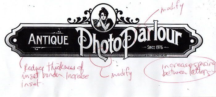
A very interesting opportunity came my way a couple of weeks ago with just the project I've been looking. I've wanted to have a piece I can "pull out all the stops" on. Multi-layered, prismatic carving, smaltz background, gold leaf, HDU, automotive paint, good strong design, maximum durability ...the woiks. After a good initial meeting with the client,her assistant and some reference materials I had assembled, I set to work. Laurie had some good input which I incorporated into the design and we arrived at this. The client stopped in again on Friday and was really pleased with the concept. Now comes the task of costing it out. She really leans toward frilly decorations, but I am hesitant about overshadowing the name and the overall theme. I might possibly add some flourishes to the end panels, however,I wanted to bridge the timeline from Victorian to early 20th century. There is a lot of work to do on lettering and layout, but before doing that, I wan't something to cost out and get a budget determined. I welcome any ideas and critiques you talented folks have out there. I always benefit and learn from these sessions we have here. Now it's my turn to get involved on this end of it .... fire away folks.
posted
Thanks Todd. I think your designs are top notch, so I know I'm on the right track now. Jake the overall finished size will be about 4-1/2' x 14'. The client mentioned she likes working "outside the borders" and so do I now thanks to Dan. That's the reasoning behind the lettering extending beyond and over the borders. I at first went crazy with the word 'Antique' but decided the "flavour" of the design and colors exudes antique, so why draw undo attention away from what the business does.. photos. The fonts are both from Tom Kennedy's Billhead offering and they work well together. This is a fun exercise, keep the ideas coming.
posted
Duncan...it's very beautiful. I'm sure it will be gorgeous. Don't you love it when you can 'pull out all the stops' ...doesn't happen that often for me.
posted
She's lovely Dunc! The only thing I don't like about it is the broken leg on the h. It's kinda neat, but it really jumps out at me and there is something about the flow of it bothers me. I suspect it will be the one thing that people will fixate on. It sems to pull my eye right out of the sign. Is that a "Gibson Girl"? I bought a second hand book of his illustrations the other day, Man that guy had a sense of humor!
-------------------- Did you ever stop to think, and forget to start again? -Winnie the Pooh & A.A. Milne
Kelly Thorson Kel-T-Grafix 801 Main St. Holdfast, SK S0G 2H0 ktg@sasktel.net Posts: 5496 | From: Penzance, Saskatchewan | Registered: May 2002
| IP: Logged |
posted
Good eye Kel, I had made some notes on things that need to be addressed when I fix up the artwork. Actually I'm probably going to hand paint it and make adjustments that way. Then I'll scan it back in. Both the customer and I want the lettering to have a real personality.
posted
Kel; I disagree w/you concerning the broken leg of the h in photo.....w/o it, I believe, you lose optical illusion of a center line, running vertical, which shows design centered, very cool...check out distance between the P's uprights, check distance of ascenders of the h and t in photo, they all center the eye optically...aw come on, tell me you see it.....
Dawg, you broached this one, the a in parlor; What bothers you about it? The weight?, ya, me too. I'd take away some of it, and match up bottom of descender to the r .....done deal, looks great........
You can noodle your work to death if so inclined, done it many a time, usually end up w/a mess when done as it's not smart art...when it counts, I stick to original finished artwork and record any cool ideas I may think of during process for future reference, heheheh.....
I like this in it's virgin look, taking into consideration changes suggested(minute in scope), good design Duncan...
-------------------- Frank Magoo, Magoo's-Las Vegas; fmagoo@netzero.com "the only easy day was yesterday" Posts: 2365 | From: Las Vegas, Nv. | Registered: Jun 2003
| IP: Logged |
posted
A lovely period layout Duncan, so many positives but I have to mention a detail, which rather jars.
Im not keen on the flattened arcs of the panel ends created when stretching the panel as one.
Its something we see so often, Im not sure everyone knows how to elongate a panel without distorting the end detail. So, Im going to take the liberty of posting a little CorelDraw step-by-step, for anyone unsure of the process.
-------------------- Arthur Vanson Bucks Signs Chesham, Buckinghamshire, England arthur@buckssigns.co.uk -------------------- Posts: 805 | From: Chesham, Bucks, England | Registered: Mar 2002
| IP: Logged |
posted
That's what I do too, Arthur...I dislike seeing a panel distorted from stretching, and I see them alllll the time. Good call.
My crits would be these: The distortion in the "Photo Parlour" is too steep and breaks up the middle of the sign. If you would loosen/lessen it, the words would look better. The black and white shows up the inconsistencies of the thicknesses, which is possibly being created by the distortion. Perhaps a more gentle wave would help, and you can always correct this as you hand-paint.
ANTIQUE needs to be closer to it, perhaps a tad bigger/longer to fill that "hole". And the leg on the "h" does need a smoother, rounded curve.
The design has loads of potential, just needs some tweaking. I think, however, that after this you are going to need to find a "Billheads Anonymous" group in your area...I think you are addicted to that font!
Love....Jill
Posts: 8834 | From: Butler, PA, USA | Registered: Jan 2001
| IP: Logged |
posted
Frank, you're right that "dog leg" h does anchor the centre of the design. However, it does look a little awkward and needs some tweaking. I'm sure I can hide the dawgee component somewhere more suttle. Arthur, Your absolutely right about that distortion. Nice demo btw. It's another thing I intended to rectify on the finished art. I had all the fills etc. done when I decided the panel needed to be elongated. I decided to play around with the proportions by stretching instead of rebuilding. I admit I was too darn lazy to correct it... bad Dawg! I too, hate it when someone obviously stretches something just to make it fit. Sure sign of an amateur! Geez, it must tick off Mike Jackson and David Bulter when someone does this to there beautiful images. This will be rectified, I promise. Jilly Good points, Laurie too felt the distortion on the Photo Parlour was a little excessive. I am with the customer on having the design excede the border confines, however, again at this point, which is very preliminary, I was way to lazy to remove the fills, modifications and distortions to tweek the amount.... again bad, lazy dawg. I think I agree a little tweaking on the position of "antique" is in order. I've made a mental note of that. Oh crap you noticed my addiction.... I can't help it Jill, I'm obsessed with that font. Okay, I have about 81 other LHF's I will try harder... there... I admitted it, that's the first step. Forgive me Tom, it's something I must deal with. I think I need a There, that's better.
posted
Im like Todd. I wouldnt change a thing. Perfection is something to strive for, but then it wouldnt have that "look" that we all strive for. A great looking sign, but with small imperfections that give it character. Nicely done dawgie!
-------------------- Maker of fine signs and other creative stuff. Located at 109 N. Cumberland ave. Harlan, Ky. 40831 606-837-0242 Posts: 4172 | From: Ages-Brookside, Ky. Up the Holler... | Registered: Jul 1999
| IP: Logged |
posted
...one of my fave new LHFs is Garner...has a perfect period look! Steve at Art & Sign fonts just put out a new one called Sarsaparilla, it's very period style as well. You know me too well Duncan...I use Chesham Sans or American Sans on EVERYTHING. I do want to buy Garner ASAP, but since LHF switched to open type fonts, and I still only have WIN98SE, I'll have to get the Gerber version. Love....Jill
Posts: 8834 | From: Butler, PA, USA | Registered: Jan 2001
| IP: Logged |
posted
I really like it as it is, Duncan... the only thing that I kept staring at was the odd angle of the 'broken leg' that Kelly referred to... I agree with Frank it needs a bend, but maybe just more curvature instead of the break.
Mr. Vanson, the step by step is very nice, but I have a question... I use CorelDraw X3 (it may be different in the older versions, I can't remember) but I don't have to Select All, Combine and break back apart to do that operation. If I just select all the components with the Pick tool, then switch to the Node Tool, (or Shape Tool as CD refers to it) I can grab the nodes and then drag it out to the width I want... no combining, breaking, or re-coloring required...
What am I missing?
-------------------- Jon Jantz Snappysign.com jjantz21@gmail.com http://www.allcw.com Posts: 3395 | From: Atmore, AL | Registered: Nov 2005
| IP: Logged |
posted
Mr Jantz, (I would rather to call you Jon, but I fear I may have upset you somehow and you would not approve) a lot of designs are grouped when imported, some are not. When a number of elements are grouped or ungrouped you cannot (as far as Im aware) select nodes from more than one element at a time, so you must combine them to select the nodes.
In case you are addressing me as Mr Vanson because you misunderstood an earlier post where I mentioned it was rather poor form to refer to oneself as Mr, please feel free to call me Arthur.
If, on the other hand, its just that you dont like me for some reason please feel free to call me whatever you like!
-------------------- Arthur Vanson Bucks Signs Chesham, Buckinghamshire, England arthur@buckssigns.co.uk -------------------- Posts: 805 | From: Chesham, Bucks, England | Registered: Mar 2002
| IP: Logged |
posted
Hehe... no, Arthur, you have not upset me. I referred to you as Mr. Vanson, because it is a ground-in habit from living in the Southern United States all my life.
I very much enjoy your posts and work, and was not asking those questions facetiously.
But try this in your Coreldraw next time, just to see if it works this way for you: when you have a bunch of components grouped, ungroup them, (but don't Break Apart) Then, using your Pick or Select Tool, select all those components, and while they are still selected, switch to the Node tool... you will be able to select all those nodes whether the items are combined or not and stretch it out...
However, if there are items such as rectangles or contours within that group, you will not be able to select the nodes, and you are shot down.. it's on to Separate, Break Apart or Convert to Curves...
((Wow, that was convoluted, probably didn't even make sense))
Edited to add: Please feel free to call me Jon.... or if you must, Jonathan, Jonny, Juan, JJ or anything else you've seen Magoo call me in the past...
[ February 04, 2007, 09:06 PM: Message edited by: Jon Jantz ]
-------------------- Jon Jantz Snappysign.com jjantz21@gmail.com http://www.allcw.com Posts: 3395 | From: Atmore, AL | Registered: Nov 2005
| IP: Logged |
posted
Well, mostly I'm pleased I haven't ticked you off somehow!
But great news on the node editing too, thank's for letting me know X3 does that. It might just confince me to give up my beloved version 9 and start using X3 all the time, despite the features I don't like about it.
I wonder in which version this was modified?
-------------------- Arthur Vanson Bucks Signs Chesham, Buckinghamshire, England arthur@buckssigns.co.uk -------------------- Posts: 805 | From: Chesham, Bucks, England | Registered: Mar 2002
| IP: Logged |
posted
DeSign looks Great Jon. Billhead is one of my most Favorite Fonts and Most over used on my Signs also. Just an idea for your Image. Do a dye sub period photo on stone washed tiles then cut them to fit the oval.
posted
That feature does not work in version 11 just tried it now, it does work in versions 12 and X3
[ February 05, 2007, 07:27 PM: Message edited by: Steve Eisenreich ]
-------------------- Steve Eisenreich Dezine Signs PO BOX 6052 Stn Forces Cold Lake, Alberta T9M 2C5 Posts: 774 | From: Cold Lake | Registered: Mar 2000
| IP: Logged |
On the "h" in Photo, I do like it coming out of the frame. How about having it come straight down, and then hooking slightly inward at a more tapered tip, instead of curving outward to a square tip as it is now.
Also, to add interest, you may want to either put the date in an oval, or have a flourish that the above word, "Parlour", is curving around.
Not sure if I'm conveying that clearly.
But, I think it does look good just as it is. My ideas are just slight accents to mess around with if you want to.
~nettie
-------------------- "When Love and Skill Work Together ... Expect a Masterpiece"
posted
Nice work, Duncan, I like it as is, but with the tail-end/serif of the h aligned along the imaginary downward curve between the two Ps.
Also, the top serifs of the h & t in Photo: I feel they need to slope down & up to give a parallel ring of negative space around the picture.
The rule (underline & overline) around Antique needs to reach the ends of the word, in my opinion, even if it disappears 'under' the A and reappears as a short line near the start of the A.
Great stuff!
-------------------- "Stewey" on chat
"...there are no limits when you aim for perfection..." Jonathan Livingston Seagull Posts: 7014 | From: Highgrove via Toowoomba, Queensland, Australia | Registered: Dec 2002
| IP: Logged |
posted
Hi Duncan, It's great to see your design. I love that era of artwork. I do agree that leaving off the shadows on the letters is the perfect choice. It just compliments the simplicity of the lady in the oval. Sweet.
-------------------- Deb Fowler
"It's kind of fun to do the impossible - Walt Disney (1901-1966) Posts: 5373 | From: Loves Park, Illinois | Registered: Aug 1999
| IP: Logged |


![[Smile]](smile.gif)


![[Applause]](graemlins/applause.gif)
![[Cool]](cool.gif)


![[Rolling On The Floor]](graemlins/rolf.gif)
![[Wink]](wink.gif)
![[Frown]](frown.gif) Okay, I have about 81 other LHF's I will try harder... there... I admitted it, that's the first step. Forgive me Tom, it's something I must deal with.
Okay, I have about 81 other LHF's I will try harder... there... I admitted it, that's the first step. Forgive me Tom, it's something I must deal with.![[Group Hug]](graemlins/grouphug.gif)


 Printer-friendly view of this topic