posted
I had a customer come in the other day. He has been a customer of Diaz Sign Art since before we used computers. All of his stuff has been hand painted. Now he wants a logo designed that he can put on his truck stitch on shirts and hats put on letterheads/biznass cards and possibly other things in the future. Hes a home builder so he wants a house incorporated in it. He liked a logo we did a while back for a lumber yard that had pine trees incorporated in it. The top two examples have a script font for Brown which I imagine he likes because he has had hand painted work done for so long, but I kind of like the bottom logos as well. Believe it or not he doesnt want to use the color brown at all (which I can kind of understand). What do you all think? Which one would you go with?
-------------------- Joe Diaz Diaz Sign Art 628 W. Lincoln Ave. Pontiac, IL 61764 www.diazsignart.com Posts: 538 | From: Pontiac, IL | Registered: Aug 2005
| IP: Logged |
posted
Hiya Joe, They all look good, but I'm leaning towards the bottom 2. I just like the look more because I would like my house to be built square and plumb. To narrow it down even further, I would pick the bottom right becasue that's the a common style of house being built lately. The only thing I would be concerend with is how would the logos look when they're dumbed down for embroidery or non digital methods of reproduction. Your shades/shadows and effects may be difficult to reproduce in some media, especially embroidery.
Havin' fun,
Checkers
-------------------- a.k.a. Brian Born www.CheckersCustom.com Harrisburg, Pa Work Smart, Play Hard Posts: 3775 | From: Harrisburg, Pa. U.S.A. | Registered: Nov 1998
| IP: Logged |
posted
Yeah I know what you mean. Usually I start in black in white and finish in color, because I was taught that if you can read the logo in black in white it will be a stronger logo, color or not. So if I need a simplified logo for embroidery work I can go back to black and white copies and not do all of the effects I use for printed work when choosing my colors. Or to save money he could just chose one color for his shirts and hats. Also we still have customers that refuse to go with printed graphics on their vehicles. They just like the look and feel of vinyl so thats another good reason for 1 color.
-------------------- Joe Diaz Diaz Sign Art 628 W. Lincoln Ave. Pontiac, IL 61764 www.diazsignart.com Posts: 538 | From: Pontiac, IL | Registered: Aug 2005
| IP: Logged |
posted
I'm liking the one just above here lower left....works well in one color and full color too. Not sure how much importance he is looking for with his first name, but it only shows up well on the one design. The W makes me think of gable peaks on a house roof.....
posted
I agree with william, either one on the left, especially the lower one. On the lower left, the first name had a lot of punch, and fills up that negative space above the house, that is present on the lower right. On the top right, I think the colors compete too much with the lettering. Awesome job, it came out great.
-------------------- Chris O'Brien Cape Cod, MA Posts: 183 | From: Cape Cod MA | Registered: Jan 2005
| IP: Logged |
posted
I like the circular layout better, but if I had to pick one, it would be the lower left. They're all great though, and the colors are right on. Nicely done Joe!
-------------------- Maker of fine signs and other creative stuff. Located at 109 N. Cumberland ave. Harlan, Ky. 40831 606-837-0242 Posts: 4172 | From: Ages-Brookside, Ky. Up the Holler... | Registered: Jul 1999
| IP: Logged |
Looks like you "nailed it" with the lower left design. I would like to see it with just a little more breathing room in the margins - the copy seems to push to the edge of every panel.
Great colors.
Bruce
-------------------- Bruce & Deb Newton Graphic Lettering San Marcos, CA Posts: 126 | From: San Marcos, CA | Registered: Sep 2001
| IP: Logged |
posted
Lower left... hands down. It would look great as a dimensional sign... TRUE 3D.
-grampa dan
-------------------- Dan Sawatzky Imagination Corporation Yarrow, British Columbia dan@imaginationcorporation.com http://www.imaginationcorporation.com
Being a grampa is one of the the most wonderful things in the world!!! Posts: 8739 | From: Yarrow, B.C. Canada | Registered: Nov 1998
| IP: Logged |
posted
Everyone seems to like the lower left but I'm not crazy about the house in that one. Nobody builds that type of house anymore. I like the contemporary house much better.
-------------------- Dave Sherby "Sandman" SherWood Sign & Graphic Design Crystal Falls, MI 49920 906-875-6201 sherwoodsign@sbcglobal.net Posts: 5400 | From: Crystal Falls, MI USA | Registered: Apr 1999
| IP: Logged |
posted
Personally, my preference is for the circular layout...upper right. Reasons: Like Dave Sherby, I feel that the rendering of the house is more "contemporary" in feeling, and would in all likleyhood reflect what the builders are doing now and down the road, in terms of style.
There's also the consideration of reproduction economies. That one, in colour could be achieved with fewer press plates, and separations....resulting in a more economical bill from the printer, both initially, and for re-orders.
The black & white version also seems to work quite effectively, for the one-color ads.
-------------------- Ken Henry Henry & Henry Signs London, Ontario Canada (519) 439-1881 e-mail: kjmlhenry@rogers.com
Why do I get all those on-line offers to sell me Viagara, when the only thing hardening is my arteries ? Posts: 2684 | From: London,Ontario, Canada | Registered: Feb 1999
| IP: Logged |
posted
Along the lines of the two different house types in the designs, which type of market does he target to build more of? The old style on the left is more for a standard builder, while the house on the right targets the upscale market.
-------------------- Dana Blair Blair Signs Wooster, OH www.blairsigns.com
If sign makers go on strike, is there anything written on their picket signs? Posts: 835 | From: Wooster, OH, USA | Registered: Jul 1999
| IP: Logged |
posted
Bottom right. The bottom left has the roof color too close to the banner color, in a sense, competing with each other. The bottom right "Brown" is more readable to me.
-------------------- Tony Broussard Graphic Details Digital Media Loreauville, LA Posts: 395 | From: Loreauville, LA | Registered: Jul 1999
| IP: Logged |
posted
Thanks everyone your comments are very helpful. Dale, I guess I never thought of the w representing gable peaks on a roof. Although I wish I did. Its funny how some things just work out that way. As far as the different styles of houses go: he does new construction and renovating & remodeling of older homes. So, its a matter of which home style he likes more. There are quite a few homes in town that look close to the one pictured on the left examples but he showed me a photo of his own home and it looks closer to the ones on the right. Tony I understand what you are saying about the red on the roof, I actually tried a few different colors including browns, blacks and grays, but I just really like the red roof. I dont know what it is.
And as far as the Ralph goes we actually discussed removing his first name all together. We discussed how he has multiple employees and he didnt want it to seem like it was one guy. But ultimately he decided to keep it because he had been going by that name for such a long time, back when it was just him. So instead, we decided to downplay the first name but still include it. I guess it will be a matter of personal preference. Does he want his first name kind of small? Or super small? I plan on showing him all these examples and letting him decide. I assume he will pick certain things on one and certain things on the other, kind of like what you guys have done. Thanks again, I'm really learning so new stuff here.
GO BEARS!
-------------------- Joe Diaz Diaz Sign Art 628 W. Lincoln Ave. Pontiac, IL 61764 www.diazsignart.com Posts: 538 | From: Pontiac, IL | Registered: Aug 2005
| IP: Logged |
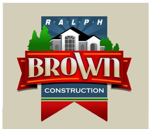
posted
This is the one I liked. They were all nice BTW. I just put a little green in & centered the copy more with the hanging banner. I realize the banner is stark, but it seems to need something more on the bottom.
I love what you had, But also love to play around a bit with nice logos.
Thanks
-------------------- Michael R. Bendel Bendel Sign Co,. Inc. Sauk Rapids, MN Posts: 913 | From: Sauk Rapids, MN | Registered: Jul 2005
| IP: Logged |
But "Ralph" needs to be in closer proximity to "Brown." I don't mind a little separation, but it's too far away for my tastes.
The "W" is out-of-place - I don't like it's distorted appearance - - it makes me look right at the "W" and nothing else.
I'm with Dave Sherby on the house image - although I'd say I don't like either....the more "modern" looking house looks more like a strip mall facade to me than a house....I'd look for something different.
The banner is too humongous....and be careful...you have some nice designs beginning to emerge, but those bottom two make me want to make a sandwhich for some reason.....
A little tweaking and you'll have it....
Edit: I just realized I had said nothing positive about the designs...shame on me! I do like the sun rays - ala the Letterville logo - eminating from behind the house. And the fact that the logo and trees poke outside the stabilizing base shapes shows you think outside the box...nice job there.
posted
Hi Joe. Here's my opinion.... On the one with the script, use the straight house. The roof angle seems to be fighting the script angle. However, the more angled house is nicer looking. If you put "CONSTRUCTION" off to the right, beside the circle, that might look really good. On both of those I would make "CONSTRUCTION" straight in a reversed panel. Again, the curve fights the angles.
Of the boxier ones, I prefer the right, but the ribbon needs to be dropped a bit lower, as you are losing the house. That roof might look nice if done in red. I think I'd also make that back panel a bit wider/shorter. I'd make the "Brown" plain white, or a grey gradient.
Both designs have lots of potential. Love....Jill
Posts: 8834 | From: Butler, PA, USA | Registered: Jan 2001
| IP: Logged |
posted
I like the bottom left. Th only think I would tweak is maybe defining the rooflines on those dormers. BUT..every one of these designs is a keeper in my book!
-------------------- Wayne Webb Webb Signworks Chipley, FL 850.638.9329 wayne@webbsignworks.com Posts: 7404 | From: Chipley,Florida,United States | Registered: Oct 1999
| IP: Logged |


![[Smile]](smile.gif)
![[I Don t Know]](graemlins/dunno.gif)


 Printer-friendly view of this topic