posted
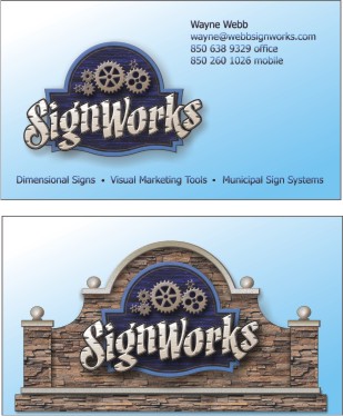
Jus a personal problem, but I don't like anything that makes me have to put my glasses on to read it. I'm thinking of the phone number and other small print. Maybe try your name and only the phone number bigger. Oh yeah, I never email mail for services. I call my auto mechanic, plumber, fence guy etc. On the bottom copy, Dememtional signs etc. it all sounds the same. Needs to be more fun on font use and size. On the bottom one, I would make the word Signs a little bigger. More word less sign. Otherwise looks great.
-------------------- Signs by Alicia Jennings (Mudflap Girl) Tacoma, WA Since 1987 Have Lipstick, will travel. Posts: 3813 | From: Tacoma, WA. U.S.A. | Registered: Dec 1999
| IP: Logged |
posted
Personally, I like to see more of a difference between the front and back of a card.
Here I would put the sign on the monument on the front of the card. Have it coming in from the left, and have left hand side of the monument bleeding off.
On the back I would just do a design with your gears, ... maybe like a watermark, or in some cool colours that compliment the front, but contrast it abit too. Then have a catchy slogan, and list some of the services you do.
-------------------- "When Love and Skill Work Together ... Expect a Masterpiece"
posted
I always put my contact information on the back in plain LARGE letters so anyone of any age can read it. Sounds simple but also incredibly effective and highly appreciated.
-------------------- Michael Gene Adkins The Fontry 1576 S Hwy 59 Watts OK 74964 Posts: 845 | From: Watts, OK USA | Registered: Jun 1999
| IP: Logged |
Make the font large enuf that an average 40 yr. old can read it without his glasses. Otherwise they just throw it in the trash.
All that space and tiny type face = throw it away.
-------------------- Leaper of Tall buildings.. If you find my posts divisive or otherwise snarky please ignore them. If you do not know how then PM me about it and I will demonstrate. Posts: 5274 | From: Im a nowhere man | Registered: Jul 2001
| IP: Logged |
posted
Make the name and phone the main elements. Nice illustration, but the name and number are the main reasons a client will use it. My two cents worth. I do get a little confused in looking at which is the front or back?
Personally, I have numerous business cards that I use that show different things for different purposes: Splash Windows, Fine Art, Dealer Services and simply one that only has my name, number and website on it. I leave the back blank as they might write something on it, like my bid, or might file it in their card case and the back gets sandwiched up against another's back in the little page windows.
They either get thrown away or put into someone's card file, so I just use the computer cards, mostly and print out as needed. For cold calling, I use a post card or a flyer as they seem to work much better with a card dropped on them as well. I also find printing out a specific flyer for one of my products and then laminating it is a great way to pass around in the conversation on the meet and greet. If they want a copy, I have some without the lam. Another trick is to give them one at their desk and leave another there. They pass it off to one of the other decision makers, there.
One of the best ways to get someone's email address is to ask them for theirs when you pass your to them. Look at their card and act like it makes an impression on you. Look for their emial address on it and if it is not there, that is the time to ask for it. Write it on the back and you have them.
-------------------- Preston McCall 112 Rim Road Santa Fe, New Mexico 87501 text: 5056607370 Posts: 1552 | From: Santa Fe, New Mexico | Registered: Nov 1998
| IP: Logged |
posted
Suggest you leave a little more negative space on the front - the "sign" seems to close to the bottom. In my opinion, it should appear to have about the same amount of negative space all around the structure. (visual not mechanical)
-------------------- Chapman Sign Studio Temple, Texas chapmanstudio@sbcglobal.net Posts: 6306 | From: Temple, Texas, USA | Registered: Nov 1998
| IP: Logged |
Personally, I like the bottom illustration, with the wall. I'd use that, with only your name and phone number (larger) on the front. Then, leave the back plain, and use a clear,easy-to-read font, outlining your services, website, etc.
Simpler is better.
-------------------- Dale Feicke Grafix 714 East St. Mendenhall, MS 39114
"I can do all things through Christ, who strengthens me." Posts: 2963 | From: Mendenhall, MS | Registered: Apr 1999
| IP: Logged |
posted
I screenprint business cards and some customers wants another business on the back which is kinda stupid.A towing business with his wife's beauty shop on the back side.Every time cards are picked up people don't look at the other side.Suppose you need a tow truck and you can't find that card your buddy gave you,but guess what..you still have it cause when you layed it down that beauty shop card suddenly hit face up. So my advice is put BIG NAME & PHONE# on front of card and briefly what you do. Leave all that stuff off the back and certainly that "FREE ESTIMATES" stuff off the front.Big corporates who own McDonalds restaurants don't put a Hardees sign on the back side of the McDonalds sign.See what I'm saying.
-------------------- Bill Wood Bill Wood, Sign Artist 3628 Ogburn Ave., NE Winston-Salem, NC 27105-3752 336-682-5820 Posts: 397 | From: Winston-Salem, NC | Registered: May 2006
| IP: Logged |
I love the logo, but not so much the stone wall. It leaves a lot of dead space on the upper corners. Might be a case where less is more and dropping the stone wall would be a better idea. Gives you more room to size up the logo.
Not to sure about the back. The blue faded backround is pulling in the text because they are in the same frequency (yup, colors have frequencies like radios) and making it harder to read. Just plain white and maybe larger text would be the way to go. Again, less is more.
Rapid
-------------------- Ray Rheaume Rapidfire Design 543 Brushwood Road North Haverhill, NH 03774 rapidfiredesign@hotmail.com 603-787-6803
I like my paint shaken, not stirred. Posts: 5648 | From: North Haverhill, New Hampshire | Registered: Apr 2003
| IP: Logged |
""Good judgment comes from experience; and a lot of that comes from bad judgment" - Will Rogers Posts: 3484 | From: Beautiful Newaygo, Michigan | Registered: Mar 2003
| IP: Logged |
posted
change the cards to a 3.5x3.5. my cards are done that way and they get comments! i have also ordered a few clients cards that large
[ September 18, 2011, 07:34 AM: Message edited by: bruce ward ]
-------------------- You ever notice how easily accessible people are when they are requiring your services but once they get invoice you can't reach them anymore
posted
Thanks for the help, all. The reason I haven't worked on this in the last few days is because I have been tied up with more pressing problems....... The fan belt broke on the air compressor while I was sandblasting. It got so hot, it blew the bottom hose slam off the radiator and then the engine shut down. I waited till the next day and poured penetrating oil in the cylinders letting it set for 4 more days then tried to turn the crankshaft with a wrench. The motor turns over easily so that is a good sign. But the thing still wouldn't start so I pulled the starter off and took it by the parts house. They put it on a tester and found that it wasn't working...I guess when it rains it pours. But that could be a good sign too because maybe that's the only reason the engine won't start. I have a headstone to blast and already have the stencil cut and applied but if my compressor is gone, I may have to refund the guy's money. The part is on order and should be here tomorrow so here's hoping. Anyway, Here's another card idea I was kicking around. The white copy on the top looks run together, and the small black copy looks illegible. They don't look this way in Corel9
[ September 19, 2011, 06:54 PM: Message edited by: Wayne Webb ]
-------------------- Wayne Webb Webb Signworks Chipley, FL 850.638.9329 wayne@webbsignworks.com Posts: 7403 | From: Chipley,Florida,United States | Registered: Oct 1999
| IP: Logged |
posted
Sorry about your compressor...hope she can be revived...this last card is just not working for me...I'm not in love with the idea of running the pic off the edge of the card...and on the back there's just too much info.
posted
There have been some good comments here...but I'm having legibility & kerning issues with the last two, with my eyesight the way it is...
-------------------- "Stewey" on chat
"...there are no limits when you aim for perfection..." Jonathan Livingston Seagull Posts: 7014 | From: Highgrove via Toowoomba, Queensland, Australia | Registered: Dec 2002
| IP: Logged |
posted
On the front of the 2nd card, try moving your ph# flush right with the .com......Looks like the number would also line up vertically with the bottom right finial and the .com, rather than just floating with no rhyme or reason.
posted
wayne i love the graphic. good for a flyer, or a sign at your shop. BUT a business card, its to much. if you want to dedicate one side to JUST THE LOGO, thats ok. but the other side need to say: WHO your business name. WHAT do you do. HOW AND WHERE to get in touch with you. last 1st, the more ways to contact you, put on the card the less people will try to get a hold of you. PHONE NUMBER, is best, big so they dont have to look for it. email, web page, smaller or not at all. WHAT YOU DO.......SIGNS & MONUMENTS or SAND BLASTED SIGNS. the rest of the stuff wont register with most people. WHO is simple, COMPANY NAME, and its better if you incorporate WHAT into that. i do card for some clients and let them get em printed, but i do the layouts. heres one i did for a local guy.
[ September 20, 2011, 01:40 PM: Message edited by: old paint ]
-------------------- joe pribish-A SIGN MINT 2811 longleaf Dr. pensacola, fl 32526 850-637-1519 BEWARE THE TRUTH.....YOU MAY NOT LIKE WHAT YOU FIND Posts: 11582 | From: pensacola, fl. usa | Registered: Nov 1998
| IP: Logged |
personally I like it ... not that I'm the decider of good layouts or anything ...
Doesn't matter to me about front or back or whatever ..... the "front" is easy to read for those that just need a number, and the "back" has some details on it and you can actually still read the number.
I think it's fine. No one but us fussy layout people would object to this card. And it seems legible.
but what do I know?
PRINT IT-!!!
-------------------- Michael Gene Adkins The Fontry 1576 S Hwy 59 Watts OK 74964 Posts: 845 | From: Watts, OK USA | Registered: Jun 1999
| IP: Logged |


![[Smile]](smile.gif)


![[Cool]](cool.gif)


 Printer-friendly view of this topic