posted
It had to be 15 yrs ago or so, i bought a color mixing guide made for opaque enamels. it has since warranted replacement. the only contact info on the guide is a PO box in Walnut Creek, Calif. i wrote to this address, with no response. is anyone aware of this guide or a similar guide on how to mix lettering enamels to a specific color?
-------------------- Bruce Eggleston Eggleston Signs 315 So. Main St. New Carlisle, Oh. 45344 Posts: 22 | From: New Carlisle, Oh. | Registered: Jul 2002
| IP: Logged |
posted
I have one too! I had tried to find contact information for then a few years ago. Judy
-------------------- Judy Pate Signs By Judy Albany, Georgia USA 229-435-6824
Live simply...Love generously...Care deeply...Speak kindly...Leave the rest to God. Posts: 2628 | From: Albany,GA,USA | Registered: Nov 1998
| IP: Logged |
posted
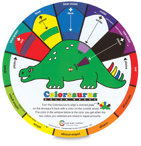
a new day has come, this is an Alvin color chart and may be used for all paints. These are sold for all artists and if you search, you can find a pocket fold over color chart that goes even further. They are used by almost every paint manufacturer
-------------------- HotLines Joey Madden - pinstriping since 1952 'Perfection, its what I look for and what I live for'
posted
The Three Sides to a Paint Color's Personality: Hue, Value, and Chroma
Colors are the basic elements of a painting. Gaining an intimate knowledge of the personalities of the colors you use is crucial in learning to paint. We tend to simply call paint a particular color, whether general such as light blue, more poetic such as aquamarine blue, or specific such as ultramarine blue. But in fact every color has three sides to its personality: hue, value, and chroma. A painter trying to mix a color on their palette to accurately match a color in their subject needs to consider all of these. If you dont, youre doomed to never get the color mixed correctly.
What is Hue?
Hue is the easiest to understand: at its most basic, its artspeak for the actual color of a pigment or object. But the use of hue becomes more complicated when it comes to the names that paint manufacturers give their paint colors. This is because the term hue is used to indicate that a color is not made from the pigment(s) that were originally used for that paint, but modern equivalents that are either cheaper or more lightfast. Judging a hue is the first step in color mixing as it identifies what tube of paint to reach for.
What is Value?
Value or tone is a measure of how light or dark a color is, without any consideration for its hue. Think of it as taking a black-and-white photo of a subject where you clearly see whats in the photo but everythings in grayscale. The problem with a colors value or tone is that how light or dark is seems is also influenced by whats going on around it. What appears light in one circumstance, can appear darker in another circumstance, for instance when its surrounded by even lighter tones. (See Tone is Relative to Other Tones for an illustration of this, and a longer explanation.)
What is Chroma?
The chroma or saturation of a color is a measure of how intense it is. Think of it as pure, bright color, compared to a color diluted with white, darkened by black or grey, or thinned by being a glaze. Variations in chroma can be achieved by adding different amounts of a neutral gray of the same value as the color you're wanting to alter. But Arent Value and Chroma the Same Thing?
Color mixing would be easier if they were, but theyre not. With chroma youre considering how pure or intense the hue is, whereas with value youre not considering what the hue is at all, just how light or dark it is.
Do I Need to Consider Hue, Value, and Chroma Ever Time I Mix a Color?
As a painter, yes you do. But the good news is that but with experience of color mixing it becomes easier and less of a systematic process. Initially its well worth taking the time to consider the hue, value, and chroma in a color youre want to match, making a judgment or decision on each before you attempt to mix the color. Youll waste less paint nor have as much frustration by mixing the wrong colors.
posted
Len once owned Western Sign Supply in Oakland. He also developed that color chart mixing 1 Shot colors. The colors on the chips were screen printed enamels, not printed representations. Many of our enamels get muddy when mixed and he wanted to arrive at a means of getting the colors clearer. Those fan decks have been out of print many years and he has also long been deceased. The only ones to find might be someone retiring and willing to part with it.
-------------------- The SignShop Mendocino, California
Making the simple complicated is commonplace; making the complicated simple, awesomely simple, that's creativity. Charles Mingus Posts: 6817 | From: Mendocino, CA. USA | Registered: Nov 1998
| IP: Logged |
posted
Thanks, all......Joey, thanks for the color chart and the brief tutorial!....Ray, could you go ahead and send that to me?....(checks in the mail!)
-------------------- Bruce Eggleston Eggleston Signs 315 So. Main St. New Carlisle, Oh. 45344 Posts: 22 | From: New Carlisle, Oh. | Registered: Jul 2002
| IP: Logged |
posted
Rick, so what you're saying is because Len lived in California and California invents everything, that Len's color chart is the only way to go? Well ain't that something.
The paint has changed tremendously where pigment was once used have been replaced by dyes and other so called equivalents, so Len's particular color chart would mean diddley in today's world.
I myself have never used a color chart but have in the past read books on color theory.
When I was younger and living in south Florida I was friendly with another striper Don Ives who had formulas and names for over 75 colors mixed for 1-Shot and even today, this chart doesn't actually help much because of the differences in the way the paint is made. All color charts only give you a sense of what to do but in actuality, no percentage rates are shown and that is the ticket.
Sorry I am so long winded but paint is something I feel so close too.
-------------------- HotLines Joey Madden - pinstriping since 1952 'Perfection, its what I look for and what I live for'
posted
I fully suspect that when Joey passes on from this world a couple hundred years from now, he's going to have his ashes mixed into his favorite HOK paint and applied by Mike Lavallee on to his latest project.
Making the simple complicated is commonplace; making the complicated simple, awesomely simple, that's creativity. Charles Mingus Posts: 6817 | From: Mendocino, CA. USA | Registered: Nov 1998
| IP: Logged |
posted
What you saying Joey, The line forms at the rear!
-------------------- Len Mort Signmaker1.com 11 Juniper Drive Millbury, MA 508-865-2382 "A Good Business Sign, is A Sign of Good Business"(1957) Posts: 811 | From: Millbury, Ma | Registered: Dec 2006
| IP: Logged |
posted
My colortones chart is one of my most treasured posessions. It resides in a lead lined vault 23 floors down, beneath the southwest side of Mt A......er let's just say it is well coveted.
You'd be better offering Ray 5K for his. I tried to get one a few years back for a friend and luckily I found a letterhead willing to part with his for a reasonable price. They ARE out there, and to the right person very valuable.
-------------------- Bob Rochon Creative Signworks Millbury, MA 508-865-7330
"Life is Like an Echo, what you put out, comes back to you." Posts: 5149 | From: Millbury, Mass. U.S. | Registered: Nov 1998
| IP: Logged |


![[Smile]](smile.gif)

![[Rolling On The Floor]](graemlins/rolf.gif)


 Printer-friendly view of this topic