posted July 20, 2009 12:19 PM
If it's not all connected try to uncompound it then ungroup it.
-------------------- Jonathan Harvey Harvey's Signs and Designs 214 N. Main Newton,KS 67114 316-283-2424 (no telemarketers) Posts: 63 | From: Newton, KS | Registered: May 2006
| IP: Logged |
posted July 20, 2009 01:17 PM
If you ungroup it, it should remove the drop shadow and just give you the vector text. When you go to re-group it, it won't activate it.
posted July 20, 2009 01:51 PM
You're right Sean. That's what happens. Maybe it can't be done. I usually work in Corel where you can break apart the drop shadows. I've got a CD cover to design and it has to be done in Illustrator.
posted July 20, 2009 02:31 PM
I just did this and I think it is what you are looking for. Type in your copy. Go to type>Create outlines. After this use the Filter>Stylize>Drop Shadow. Then just ungroup and you should be able to move the letters and shadows separately. Hope this helps.
-------------------- TJ Duvall Diamond State Graphics, Inc.
New Castle, DE 19720 Posts: 396 | From: New Castle,Delaware | Registered: Jul 2002
| IP: Logged |
posted July 20, 2009 09:43 PM
could not find how to separate the shadow in illy. but... what I did last is save the ai (text as path if needed) ...so, save the file as a pdf in native color and bla bla bla, etc...
import in corel ungroup in x3/x4 right mouse clic the shadow return-revert symbol to object (or something similar) [my corel is now in french ]
cé ç`la, that's it!
need illustrator and corel
-------------------- Élaine Beauchemin scrip Lettrage Scripsit inc. St-Hubert, Quebec, Canada www.scripsit.net Posts: 1096 | From: Saint-Hubert, Québec, Canada | Registered: Nov 1998
| IP: Logged |
posted July 21, 2009 12:01 AM
Hey thanks Elaine! It works! Too bad I got the job done before I saw your post. I wish some things were as easy in illy as they are in Corel. The problem with Corel is the drop shadows and lenses never print properly when sent to a commercial printer. The CD company will take a Corel file but they warn you about the drop shadows. If you send the corel file to photoshop as a PSD it will correct the problem most of the time. The drawback is you lose the crispness on smaller type. It's always something.
posted July 21, 2009 01:17 AM
If anbody's curious, here's a screen capture of the CD jacket. Part of the inside cover w/ map, front & back covers. It's for a couple of guys I work with who sing & write cowboy songs. The theme is Old Nevada Roads. Part of the map you can't see has the Black Rock desert and Mt. Shasta. The cover font is LHF Gunslinger. Someone else took the photos but I added the lighting effects, wood grain, etc (the front cover's actually a composite). These guys sound great and are really fun to watch.
posted July 22, 2009 03:11 PM
Brent, Copy your original lettering,create a new layer,paste the copy on the new layer then you can move them independantly.
posted July 23, 2009 09:13 AM
Brent . . . nice work - clean. Too often designers put too much effort into exploring all the computer tricks on CD covers . . . and other graphic applications as well . . .
Yours is very 'polite' and true to the type of music . . . excellent. Sometimes less IS more . . .
-------------------- Jay Allen ShawCraft Sign Co. Machesney Park, IL jallen222@aol.com http://www.shawcraft.com/
"The object of the superior man is truth." -Confucius Posts: 1285 | From: Machesney Park, IL, USA | Registered: Nov 1998
| IP: Logged |
posted July 23, 2009 12:02 PM
Gee, thanks Jay. You're right... flames, exploding heads and grunge effects aren't alway appropriate. Hey, I drove through Belvidere when I left Chicago a couple of weeks ago. Nice murals!


![[Smile]](smile.gif)
![[Wink]](wink.gif) ]
]![[I Don t Know]](graemlins/dunno.gif) It's always something.
It's always something.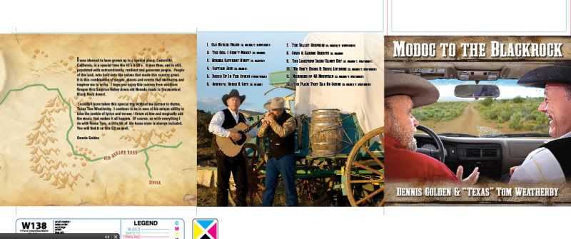


 Printer-friendly view of this topic