posted
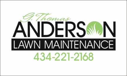
I've been playing around with this layout, and decided to try out Dan Mika's advice in SignCraft ("Turn that O into an "Ohhhh!") .... does it work? - or is it more an "Uh?" The bottom 2 are just ideas I was working on before the "O" idea Any advice gratefully received as always - thanks, Karen
-------------------- Karen Stanley Signs & Wonders Amherst, VA Posts: 136 | From: Amherst, VA | Registered: Jan 2007
| IP: Logged |
posted
It works for me! I like the top one although I 'm not a fan of the G in that top font. THe lighter fonts in the examples below may work better for the G Thomas.
-grampa dan
-------------------- Dan Sawatzky Imagination Corporation Yarrow, British Columbia dan@imaginationcorporation.com http://www.imaginationcorporation.com
Being a grampa is one of the the most wonderful things in the world!!! Posts: 8738 | From: Yarrow, B.C. Canada | Registered: Nov 1998
| IP: Logged |
posted
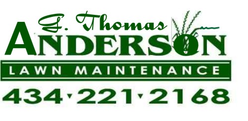
It is a great start, but "Belwe" seems to not fit the occasion to me. I think it would look better with a skinny block letter (Avante Garde) family with the G. Thomas in the same font.(but smaller)?? Taking that the guy's name is G. Thomas Anderson, but that is just me. The "Lawn Maintenance" in the reverse panel is great!!
[ July 18, 2008, 06:34 AM: Message edited by: david drane ]
-------------------- Drane Signs Sunshine Coast Nambour, Qld. dranesigns@bigpond.com Downunder "To err is human, but to really foul things up requires a computer" Posts: 965 | From: Nambour, Qld. Australia | Registered: Nov 1998
| IP: Logged |
posted
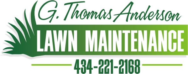
I love the idea of using that "O" in the way you've depicted. Like Dave, I am not in favor of the Belwe, although I have always liked that font. I took his suggestion of Avant Garde and gave it a whirl. Used my fave script, Valentino, on the name, but I did try it in a lighter weight of Avant Garde. I tried black rather than the dark green, with a spring green accent. (well in Corel it was a spring green) As always, I love using a reverse panel in a layout. I probably use it too often but it's tried and true. I think you have a great start, just need some TLC. Love....Jill Oops! Forgot to add the pic:
[ July 18, 2008, 08:36 AM: Message edited by: Jillbeans ]
Posts: 8834 | From: Butler, PA, USA | Registered: Jan 2001
| IP: Logged |
I really like the top example, I'm not really crazy about the scripty font on the top.
Perhaps, if you use the font on the bottom examples. As far as the overlaping, I would make an outline of the overlaping letter, and remove the bottom with it, rather than a reverse color. ( I hope that makes sense.)
-------------------- Mark Kottwitz Kottwitz Graphics Ridgely, MD www.SeeMySignWork.com -------------------------- Imagination is more important than knowledge. -- Albert Einstein Posts: 746 | From: Ridgely, MD | Registered: Oct 2000
| IP: Logged |
Minor exceptions would be different look for grass and a secondary color for the block behind "lawn maintenance"..... but the layout and font choices are outstanding.....
Makes me want to mow my lawn [almost ]
Karen - your original layouts have some merit... but the font choices aren't ideal as a few mentioned.
My other critique would be the "grass" image you have looks like a weed to me - or grass that has gone to seed. Not sure you want an image of unkempt grass associated with a lawn *care* logo.... the grass should look tidy and neat - my opinion.
Again... study Jill's layout - - nice fonts, balance, legibility, etc.
-------------------- Todd Gill Outside The Lines Potterville, MI Posts: 7792 | From: Potterville, MI | Registered: Dec 2001
| IP: Logged |
posted
Wow everyone - thank you for the lessons! I have been playing around a bit with the fonts ... I really like your suggestions, just gotta get some good scripts Todd... that's exactly what the grass is - part of my lawn wasnt mown in so long that the grass went to seed ! so I drew some... I guess I was thinking that if you have looong grass you need to get some lawn maintenance? I'll keep working on it and again appreciate all and any advice Karen
[ July 18, 2008, 11:59 AM: Message edited by: karen m stanley ]
-------------------- Karen Stanley Signs & Wonders Amherst, VA Posts: 136 | From: Amherst, VA | Registered: Jan 2007
| IP: Logged |
quote: It is interesting how people want their (name) before the service and contact number.
What are you saying Stephen - that it might be better / okay to put the service + ph number first and the name last?? It would be interesting to play around with that - very non-traditional. Would that really work? Do you have any examples - I love new ideas but don't want to go off on a wild tangent karen
-------------------- Karen Stanley Signs & Wonders Amherst, VA Posts: 136 | From: Amherst, VA | Registered: Jan 2007
| IP: Logged |
posted
I think the "name" in this case is the business name.... I don't see the "lawn service" and phone number as being at the top and dominant.
I think it would be a major mistake to change the emphasis to "lawn service" and the phone number....."lawn service" is a generic term for what "Anderson" the company does.....
My 2 cents. But let's see what it looks like...
-------------------- Todd Gill Outside The Lines Potterville, MI Posts: 7792 | From: Potterville, MI | Registered: Dec 2001
| IP: Logged |
posted
Is "G. Thomas Anderson" the guy's name or is his name "G. Thomas" and he comes from Anderson (town) Lawn Maintenance? If his name is "G. Thomas Anderson" then the script (in Jill's layout) does not belong.
-------------------- Drane Signs Sunshine Coast Nambour, Qld. dranesigns@bigpond.com Downunder "To err is human, but to really foul things up requires a computer" Posts: 965 | From: Nambour, Qld. Australia | Registered: Nov 1998
| IP: Logged |
posted
Here's a simple way of combining the name G. Thomas Anderson while highlighting what they do, not who they are. But then we lose the fun "O"!
This layout is just a suggestion, but not the way I would normally do a layout. In my work, I typically play up on the name, not so much the service. For example, why make "TOWING" real big on a tow truck? It is obvious that is what task the company performs. Therefore I highlight the name. Same with lawn service businesses. Usually if you see a truck parked at a house with a hot guy on a stand-up mower, you know he's a lawn man. So make his name stand out rather than LAWN MAINTENANCE. That way his prospective clients can see his name and remember it. Same with contractors, as there are so many around here.
I NEVER highlight a phone number tho. I keep it understated, which I know some will argue. But if one can easily spot and remember a name, the business can be contacted later on via the Internet or a phone. I dislike when a phone number is given the most emphasis on a sign. Just my 2¢ Thanks for being a good sport, Karen. Love....Jill Posts: 8834 | From: Butler, PA, USA | Registered: Jan 2001
| IP: Logged |
posted
I agree Jill, most people don't recall the phone number. I always understate it unless the company is pushing a free call number. I like your layout above but feel like the G.Thomas is oversized. Just my 2C worth!!
-------------------- Anne McDonald 17 Karnak Crescent Russley Christchurch 8042 New Zealand
"I used to be indecisive, now I'm not so sure" Posts: 877 | From: Christchurch | Registered: Sep 2006
| IP: Logged |
posted
I like your thinking, Stephen! Do you even KNOW what the inside of the box looks like? LOL!
-------------------- Catharine C. Kennedy CCK Graphics 1511 Route 28 Chatham Center, NY 12184 cck1620@taconic.net "Look at me, Look at me, Look at me now! I't's fun to have fun, But you have to know how!" Posts: 2173 | From: downtown Chatham Center, NY | Registered: Feb 2004
| IP: Logged |
posted
But does this mean the grass will be cropped by the pony rather than G. Thomas Anderson? Love....Jill
Posts: 8834 | From: Butler, PA, USA | Registered: Jan 2001
| IP: Logged |
And neither would this idea following that logic...
Creative thinking is fine, but there are certain design truths that stand the test of time.... and one of them is brand recognition.... you don't get brand recognition by making the generic "lawn Maintenance" the element with the greatest emphasis...
Who's lawn maintenance?? Could be anybody's lawn service....
If I saw a True Green lawn care truck drive by.... I want to see "True Green" first.... it conjures up a lot of emotional response as it relates to brand recognition and reputation: Immediately you tie the name into their commercials, you tie the name into the positive comments you've heard your neighbors make about using their service, you tie into all manner of marketing themes, jingles, etc you've seen and heard.
Now, contrast that to seeing a truck drive by that boldy says "Lawn Maintenance"....with the brand identity almost hidden.....
It means very little and evokes almost no visual and metal connection and no emotional response to the brand. All it says to me is: This must be some weekend handyman trying to make a buck....it totally lacks a professional image.
The exception being a product that is so widely known, such as the Volkswagen Beetle, that simply having a picture of the vehicle in an add will instantly make you think "VW."
In this case.... Lawn Maintenance doesn't strongly relate to any particular business.
Sorry dude... doesn't work for me....
Thinking too far out of the box can be disastrous; Imagine deciding to put a tires treads on the inside of the tire instead of the outside surface? LOL.
*Outside The Lines* refers to creative style.....not rearranging basic building blocks of good design.
At least - that is my take on it.
What's a newspaper?? Is that one of those antiquated print and deliver rags that contain regionally biased information which continually decline in readership?
-------------------- Todd Gill Outside The Lines Potterville, MI Posts: 7792 | From: Potterville, MI | Registered: Dec 2001
| IP: Logged |
posted
I get jobs like this all the time, where the name is too big, the name is confusing, they want their whole family name worked into the layout, etc.
Unless they're paying you more for your time, that's when they get the basic layouts, and then I try to follow Todd's suggestion.
Keep the important stuff dominant and legible!!!
Throw on a phone number, thank you, have a nice day!!!
Jill beans 2nd layout (or one like it) is your safest bet. Unless the customer hates it. Then you just do what the customer wants and ya goes on!
Like I said, I get this stuff all day long and I've learned that simple, simple, simple is best.
-------------------- Michael Gene Adkins The Fontry 1576 S Hwy 59 Watts OK 74964 Posts: 845 | From: Watts, OK USA | Registered: Jun 1999
| IP: Logged |
posted
OK, I'll throw in my 2c worth. I spent 10 years as a visualiser/copywriter for an advertising agency before I went solo signwriting.
Stephen: Yes, a picture is worth a thousand words, but WTF has a horse eating grass going to do to the customer's image of service and care? I agree, thinking outside the box works, but layout and image can suffer.
Todd is right to some extent. Brand recognition is very important with all the competition.
Jilly's first design looks best to me, although with a little more resizng of the elements, Karen's first one does too.
Karen: Take the "G. Thomas" down in size and weight. Nice flowing script. Then make the "Lawn Maintenance" panel in equal weight (size) to the word "Anderson". Your treatment of the grass in the "O" is enough to pull the logo out of the ordinary.
If people don't remember the phone number they will remember "Anderson Lawn Maintenance"
Maybe that was 5c worth
[ July 22, 2008, 04:57 PM: Message edited by: Jon Butterworth ]
posted
Stephen - I like it! It captured my attention and made me laugh It certainly challenges me to think differently about my designs - thank you!!! Michael - I hear what you're saying but... For my first 8 years in this business it was pretty much just basic/simple stuff "throw on.... thankyou, have a nice day". But now I'm running my own business and am in the wonderful position of not HAVING to make any sale (I work at home) So with any job I get I try to use it as an opportunity to improve my skills. I don't get paid for all my design time but then again I could be paying to go to college and get taught all this stuff that I'm learning right on the job... and on Letterville!!! And I appreciate everyone's efforts to teach me with this one Jon - I thought I had it finished but might have to tweak it just a bit.... THANK YOU all! Karen
-------------------- Karen Stanley Signs & Wonders Amherst, VA Posts: 136 | From: Amherst, VA | Registered: Jan 2007
| IP: Logged |
posted
I'd really like to see what you came up with Karen. When all was said and done I still liked your first design the best. The only thing that bothered me was the G. Thomas I envisioned a tweak like this where it nested between a larger A and the taller grasses of the O. Please ignore the mismatched font and the quick and dirty manipulation, but it gets my idea across anyhow.
Your design has a nice unique character that appeals to me. I guess it doesn't address the concerns with the size of the phone # vs the services though.
-------------------- Did you ever stop to think, and forget to start again? -Winnie the Pooh & A.A. Milne
Kelly Thorson Kel-T-Grafix 801 Main St. Holdfast, SK S0G 2H0 ktg@sasktel.net Posts: 5496 | From: Penzance, Saskatchewan | Registered: May 2002
| IP: Logged |
posted
With the exception of the "o" I really like Arthur's solution. I think it puts good emphasis on what's most important to see first, and subordinates the rest. It would look great on the side of a truck.
My mind wanders. And that's not a good thing, 'cause it's too small to be out there alone. Posts: 3129 | From: Tooele, UT | Registered: Mar 2005
| IP: Logged |
posted
Bottom line. Park a truck with any of the original designs on it side by side with Stephens and who are you going to call. I say the originals. Much more of a corporate logo for a vehicle. Stephen's looks like a business card you trying to use for everything you have like truck doors, 4x8 building sign and the real estate signs. It just won't work. The originals would easily be broken apart and moved around for different applications. I'm all for thinking outside the box but many times the "norm" is where you need to go. Go to Dan Antonelli's site and just look at the logo design. It all works amazingly. I often go there to soak it in before working on new logos for a client. Sorry Stephen it just doesn't work for me.
-------------------- Rob Larkham Sign Techniques Inc. Chicopee, Ma Posts: 607 | From: Chester, Ma. | Registered: Apr 2002
| IP: Logged |
quote:Originally posted by Robert Larkham: Bottom line. Park a truck with any of the original designs on it side by side with Stephens and who are you going to call. I say the originals. Much more of a corporate logo for a vehicle. Stephen's looks like a business card you trying to use for everything you have like truck doors, 4x8 building sign and the real estate signs. It just won't work. The originals would easily be broken apart and moved around for different applications. I'm all for thinking outside the box but many times the "norm" is where you need to go. Go to Dan Antonelli's site and just look at the logo design. It all works amazingly. I often go there to soak it in before working on new logos for a client. Sorry Stephen it just doesn't work for me.
I agree.. A half second glimpse is what one needs to sink in straight away!! Jill's first layout was the best with the exception of using the same font except much smaller in the top line instead of the script.
-------------------- Drane Signs Sunshine Coast Nambour, Qld. dranesigns@bigpond.com Downunder "To err is human, but to really foul things up requires a computer" Posts: 965 | From: Nambour, Qld. Australia | Registered: Nov 1998
| IP: Logged |
posted
Stephen I run a a large format digital printer all day long. I get what your saying but from your layout I don't know if the guy is cutting grass or giving pony rides. I too incorporate photos into my work but try to make the photo relevant to the business. There is outside the box and then there is WAY outside the box.
-------------------- Rob Larkham Sign Techniques Inc. Chicopee, Ma Posts: 607 | From: Chester, Ma. | Registered: Apr 2002
| IP: Logged |
posted
Don't take your post down...it's been a good discussion... with a wide range of opinion... not hammering on you in a personal way Stephen... Have a good one.
If you wanted to create an image that would really stick in people's minds...humor might be the route to go.
Imagine having a guy walking behind a goat, holding onto reins that are attached to a harness on the goat....while the goat is moving forward eating (mowing) the grass.
Now that would be funny, and an image that would stick.
-------------------- Todd Gill Outside The Lines Potterville, MI Posts: 7792 | From: Potterville, MI | Registered: Dec 2001
| IP: Logged |
posted
or better yet...two sheep...with sexy black leather harnesses of course...with someone from nh(or mass)...i dunno...ron costa maybe or bob peach(one of them for sure)...standing behind them with a(i should stop now)...but todd, come on...you can whip that up in photoshop quick!
-------------------- Karyn Bush Simply Not Ordinary, LLC Bartlett, NH 603-383-9955 www.snosigns.com info@snosigns.com Posts: 3516 | From: Bartlett, NH USA | Registered: Jan 2001
| IP: Logged |


![[Smile]](smile.gif) Any advice gratefully received as always - thanks, Karen
Any advice gratefully received as always - thanks, Karen


![[Wink]](wink.gif) ]
]


![[I Don t Know]](graemlins/dunno.gif)
![[Rolling On The Floor]](graemlins/rolf.gif)


 Printer-friendly view of this topic