posted
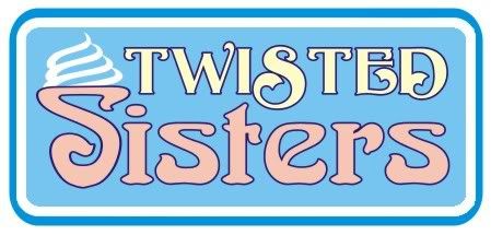
This is a design I did for friends a few years back when they opened an ice cream shop. Their little place has become very well known and has surpassed their expectations for success. They are looking at moving (just a few hundred feet from their existing place). Between the move and the possibility of franchise in their near future it seems a good time to nail down a consistent image. I think the current logo is fairly well known now and so although some room for change may be there, a completely new image is not likely advisable. One thing I suggested was using the T&S to design a simpler logo that they could have printed on their cups and wrappers. A quick and rough idea was this
Any comments on what or how much to change would be carefully considered. Also any creative takes on a short version would be great to see. Thanks.....
-------------------- Did you ever stop to think, and forget to start again? -Winnie the Pooh & A.A. Milne
Kelly Thorson Kel-T-Grafix 801 Main St. Holdfast, SK S0G 2H0 ktg@sasktel.net Posts: 5496 | From: Penzance, Saskatchewan | Registered: May 2002
| IP: Logged |
posted
That's what I thought when I first saw it too - Twisted Sister's the well known rock band.
But then again, someone told me that "Outside The Lines" was the name of an ESPN sports segment that occasionally airs on their program....although, not being an avid sports tv spectator, I had never heard of it before. Who came up with the name first, I honestly don't know. I came up with my name about around 1988 or thereabouts - as the thought that I wanted to be known for doing things a little more than "ordinary" - more creative and original - don't know that that has been the outcome - but that was the thought at the time I came up with my company name. Coloring outside the lines in a coloring book kind of idea - bucking the rules sort of notion.
Anyway, back to the logo posted here....Kelly, I honestly would have suggested a redesign in this case as I (you want an honest opinion, right?) don't particularly care for the logo design.
The name combined with the font choice would make me think the business was a 1960's mary-jane coffee shop in Amsterdam.
I'm not quite sure what you're asking because you mention that the business has had success and they are hesitant to change their logo...because they feel people are accustomed to seeing it.
One thing I'd suggest for sure: Ditch the BROWN. Brown on blue is a bad color choice - very muddy. I've noticed you really like brown for some reason as you use it a lot - at least from what I've seen posted. Ya gotta be careful with brown.
My initial reaction is that the font you used is very - I don't know how to say it except - ugly. But given the fact that you/they want to retain some semblance of an identifiable logo style - I would suggest leaving "Sisters" as is, but changing "Twisted" to something very sans-serif and BOLD.
You might also redo the dollop of ice cream - make it more symmetrical as a ice-cream twisted cone would be rather than a kiddish sort of blob.
I do like the idea you show of a square substrate/background over the round cornered version...in that you have too much rounded everything in the top version: rounded fonts, rounded ice cream, rounded border.....it's too much rounded everything.
Don't know if this helps, My 2 cents.
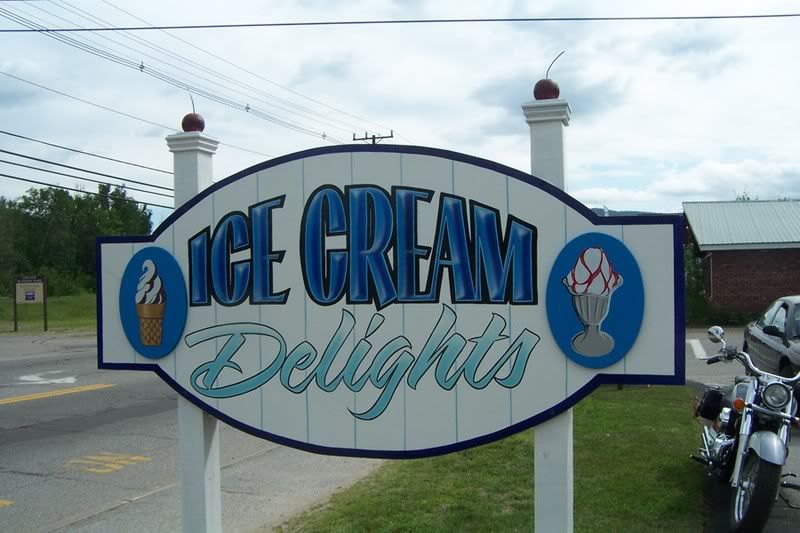
Edit: Do a search on Ray Rheaume's ice cream sign....I recall he did a pretty neat looking one which he posted a few months back....might get some idea's there.
posted
I have changed my own "identity" several times over the years as my design skills grew. I have found that it brings a whole lot of new attention to my business. It also updates my image. And my old customers always seem to find me.
-------------------- Deri Russell Wildwood Signs Hanover, Ontario
You're just jealous 'cause the little voices only talk to me. Posts: 1904 | From: Hanover, Ontario, Canada | Registered: Dec 1998
| IP: Logged |
posted
Thanks for the input. The name Twisted Sisters (with an S) has been a real drawing card for them. Initially I really questioned it, but it has worked. A lot of people say they stopped because of the name and there are always sisters getting their pictures taken under the sign. I'm not fond of the logo either, which is why I suggested it would be a good time to update it. I know this isn't by any means my best work, I got lotsa uglies in my past (probably some in my present and future too )and this place has helped me improve, but we chose the art noveau font because it looked "ice creamy". The word twisted is actually in gold not brown...must be a monitor thing, and the blue it sits on is just the background colour, not any particular size or shape. I guess what I would like to do is change it enough to make it more appealing while still maintaining enough of the original look to allow the old and new work together. The blue and white and sunny yellow are a given, the gold could be removed. So I guess my question is how far do I go....work with the existing "layout" and change the fonts, change the layout and modify the font to make it more appealing, change the colours - perhaps the word twisted to white, cream or a pale blue perhaps? Ideally it would retain it's overall first look yet be more asthetic.
-------------------- Did you ever stop to think, and forget to start again? -Winnie the Pooh & A.A. Milne
Kelly Thorson Kel-T-Grafix 801 Main St. Holdfast, SK S0G 2H0 ktg@sasktel.net Posts: 5496 | From: Penzance, Saskatchewan | Registered: May 2002
| IP: Logged |
posted
Todd, I think that colour isn't brown but gold.
Kelly, in my opinion it wouldn't hurt the business to come up with a brand new logo to match the expanding business, but here's a different take on basically the same idea (would need some refining):
Kelly, in all honesty, I think you should scrap the old logo and try something new. Your area is small enough that everyone will still know the shop. Since it is moving to a new location, a new look would be well in order. Now is a good time to upsell them to a better logo, and an entire branding image if they are going into a franchise. You have come a long way since that design and now it's time to show them just what you can do for them.
Love....Jill
Posts: 8834 | From: Butler, PA, USA | Registered: Jan 2001
| IP: Logged |
My mind wanders. And that's not a good thing, 'cause it's too small to be out there alone. Posts: 3129 | From: Tooele, UT | Registered: Mar 2005
| IP: Logged |
posted
I agree, maybe I'll punch in their colours and see if they like it...that OK with you?
-------------------- Did you ever stop to think, and forget to start again? -Winnie the Pooh & A.A. Milne
Kelly Thorson Kel-T-Grafix 801 Main St. Holdfast, SK S0G 2H0 ktg@sasktel.net Posts: 5496 | From: Penzance, Saskatchewan | Registered: May 2002
| IP: Logged |
posted
I vote for a whole new look. It can actually enhance biz! I LOVE the colours Todd has introduced. Very ice cream looking!
For a short time, their new sign could even have a small addition that could be removed such as, "Formerly... insert small old logo"... "Now introducing...", you get the idea.
Something else that seems to keep coming to mind is, seeing the word sisterS, with it being plural, it's like there ought to be 2 cones in the logo. Or another icecream treat along side a cone. Something to emphasise 2.
I hope the 'sisters' go through the proper channels to get that logo checked out. If they wish to franchise, I can't see it being ok with the band being so closely named.
[ November 03, 2007, 12:48 AM: Message edited by: Donna in BC ]
posted
I think the font used in the original photo makes people think of the rock band, even with the "S" at the end. Lotti's and Todd's choice of fonts is far from a hard Rock band, and they both seem to change your imagination away from the "Heavy Metal" theme. The font in the original is something most would be used to seeing from a rock band. Maybe if the ice cream ladies want to have a name so close to a rock band, they need to differentiate (spelling) themselves from the Band by going with a less funky font.
posted
Thanks all. I'm no expert in it but I believe that there is no legal problem with the name. Firstly it is sisters not sister and because they are sisters and it is a fast food place not a band, it seems like there should not be any conflict. In addition they are in two different countries. The name wasn't after the rock band, rather the fact they sell soft ice cream (twisted)and the fact they are a couple of characters. It is an interesting topic though. I know in Canada if someone has a name registered, no one in direct competition (in the same type of business) can use the name. Thus you can have the Hard Rock Cafe or the Hard Rock Constuction Company or Hard Rock Records etc. When you go to register your company you need to pay for a name search where they check to see there are no conflicts before you are granted the name. Once your name is deemed available you pay to register it and as long as you renew it it remains yours. I suspect the process is similar in the States, but I also suspect big bands like that could afford to sue you if they wanted to make an issue of it. Big money talks.
-------------------- Did you ever stop to think, and forget to start again? -Winnie the Pooh & A.A. Milne
Kelly Thorson Kel-T-Grafix 801 Main St. Holdfast, SK S0G 2H0 ktg@sasktel.net Posts: 5496 | From: Penzance, Saskatchewan | Registered: May 2002
| IP: Logged |


![[Big Grin]](biggrin.gif)


![[Wink]](wink.gif) )and this place has helped me improve, but we chose the art noveau font because it looked "ice creamy". The word twisted is actually in gold not brown...must be a monitor thing, and the blue it sits on is just the background colour, not any particular size or shape.
)and this place has helped me improve, but we chose the art noveau font because it looked "ice creamy". The word twisted is actually in gold not brown...must be a monitor thing, and the blue it sits on is just the background colour, not any particular size or shape. ![[I Don t Know]](graemlins/dunno.gif)


 Printer-friendly view of this topic