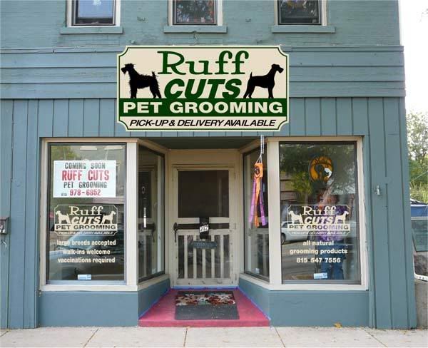
I designed this 4x8 to go on a different building. Then the customer decided on this location, I suggested that we go with a 3 by something. This building had a 3x16 on it previously. The customer liked this layout and didnt want to spend the additional cost to go with a 3x16.
They went to the city to get a permit and were told no because the sign doesnt fit the building am I being close minded I realize that a 3x? would look better but I dont see a problem with this one?
Thoughts?
Thanks, Jeff
-------------------- Jeff's Lettering Lisa,Luke,Dara, and Jeff Spradling 5742 Shattuck Rd. Belvidere, Il. 61008 815-544-0167
Surviving another day. Posts: 626 | From: Belvidere, IL USA | Registered: Jul 2000
| IP: Logged |
posted
Hiya Jeff, I do think a 3' tall sign would be more appropriate for the space. Do you think the sign can be (safely) installed in that location? That should be the only thing the city can legitimately complain about. If they're saying they don't like the way the sign looks, I think they're being inappropriately restrictive which can become a first amendment issue - unless the location is in some sort of BS hysterical district regulations.
Havin' fun,
Checkers
-------------------- a.k.a. Brian Born www.CheckersCustom.com Harrisburg, Pa Work Smart, Play Hard Posts: 3775 | From: Harrisburg, Pa. U.S.A. | Registered: Nov 1998
| IP: Logged |
posted
Doesn't fit the building? Do they mean because of square footage or historical significance or what?
Just not fitting the building sounds like an opinion matter and not something than can be written into an ordinace. Who is to decide whether something looks "right" or not. How do you get anyone to agree on what looks like "fitting"?
I would like to hear the description of what would look right for that location. Mainly because they would have to have a written description for every location in town because each building has a different look and thus need a different looking sign. It should be necessary to have a description in place before the sign is permitted rather than just looking at the sign after the fact and saying "nope".
A lawyer would have fun with this one.
-------------------- Chapman Sign Studio Temple, Texas chapmanstudio@sbcglobal.net Posts: 6306 | From: Temple, Texas, USA | Registered: Nov 1998
| IP: Logged |
posted
Yes, this in our downtown historic district I have recently posted about. We are working with the city to revise the ordinance, but things like this that are a matter of opinion are driving me nuts. Mainly the inconsistencies!
The square footage is fine they think the sign should only be on the 29 horizontal area. I try to design things so as to make the best use out of materials.
Jeff
-------------------- Jeff's Lettering Lisa,Luke,Dara, and Jeff Spradling 5742 Shattuck Rd. Belvidere, Il. 61008 815-544-0167
Surviving another day. Posts: 626 | From: Belvidere, IL USA | Registered: Jul 2000
| IP: Logged |
posted
Ray, That looks nice I do have the ability to think out side the square just not always the budget. When they ask for the cheapest price you can give them for a 4x8 and $400-$450 for a simple design makes them squirm ya doubt theyre going to go for something nice like you laid out. This one falls under the cheap startup syndrome.
The other side note is, our ordinance only allows for a total of 3 colors on a sign, any shades, tints and so forth constitute a color, therefore what you designed would not be allowed in that district.
I do like what you did Ray what would the cost of that be? Dont you ever have to do a sign that is not an award winning masterpiece ya know just a simple design for a small budget?
Jeff
-------------------- Jeff's Lettering Lisa,Luke,Dara, and Jeff Spradling 5742 Shattuck Rd. Belvidere, Il. 61008 815-544-0167
Surviving another day. Posts: 626 | From: Belvidere, IL USA | Registered: Jul 2000
| IP: Logged |
posted
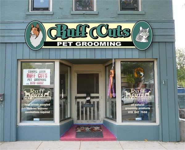
To my tastes, the sign isn't comfortable in the space. Is there much difference between the price of a 4x8 and a 2X12 or 2x16 which I think would look a lot more at home. I also don't like the redundancy of the same image three times (on both windows as well as the sign). I think going to a different format would help that issue as well. You can still use all the same elements just rearrange them. I usually consider a simple layout like that part of the process, not a "design" fee. The other thing I would consider is changing to a colour that suits the existing building a little better. Just tweaking the shade of green might work. I realize we all have different tastes and opinions and I don't mean this in any way offensively. Ultimately what matters the most is how we can best serve the customer, and all rights aside, I feel there are some better options here.
-------------------- Did you ever stop to think, and forget to start again? -Winnie the Pooh & A.A. Milne
Kelly Thorson Kel-T-Grafix 801 Main St. Holdfast, SK S0G 2H0 ktg@sasktel.net Posts: 5496 | From: Penzance, Saskatchewan | Registered: May 2002
| IP: Logged |
posted
"Dont you ever have to do a sign that is not an award winning masterpiece ya know just a simple design for a small budget?"
All the time, Jeff. One color coro step stakes, cut and stick RTA truck lettering, quicky realtor signs, etc.
Easy enough to keep the town fathers happy by dropping the dog & cat and using the silhouettes, changing the sub text to cream...back down to 3 colors that quick without losing a whole lot.
You know, even the cheap startup businesses want to look good from day one and I've never had a customer come back after a year or two for a better looking sign. Most just leave them up there and forget about them 10 minutes after it's hung up. It'll be there for years. (heck, I've even seen banners stay up for 3+ years around here...lol)
I'm on the outside looking in on this one, but it seems that, no matter how much the customer flinches or winces at the tab, they are going to have to fit the town's requirements...and bite the bullet if needed.
There's a happy middle ground in there somewhere...aim for it. Let them know they are going to get their money's worth, it will be effective and remind them...it's a lot better to look professional than to just look open.
Even at twice the price you gave them, they'll still make more from a good looking sign than what they spent on it...always. Rapid
-------------------- Ray Rheaume Rapidfire Design 543 Brushwood Road North Haverhill, NH 03774 rapidfiredesign@hotmail.com 603-787-6803
I like my paint shaken, not stirred. Posts: 5648 | From: North Haverhill, New Hampshire | Registered: Apr 2003
| IP: Logged |
Fighting is almost useless! So play their silly game and give them someting easy to produce and meet their requirements:
As far as the customer squealling about the price...all new businesses do! Seems they forget about signs until the last minute, need it by Thusday for the Opening, and expect it for $39.95!
-------------------- Si Allen #562 La Mirada, CA. USA
(714) 521-4810
si.allen on Skype
siallen@dslextreme.com
"SignPainters do It with Longer Strokes!"
Never mess with your profile while in a drunken stupor!!!
Brushasaurus on Chat Posts: 8827 | From: La Mirada, CA, USA | Registered: Nov 1998
| IP: Logged |
posted
"it's a lot better to look professional than to just look open"
That's a Keeper, Ray! Must remember to use that one in the appropriate situation. It says it all, if "They" can hear it!
-------------------- John Lennig / Big Top Sign Arts 5668 Ewart Street, Burnaby, British Columbia, Canada bigtopya@hotmail.com 604.451.0006 Posts: 2184 | From: Burnaby, British Columbia,Canada | Registered: Nov 2001
| IP: Logged |
posted
Jeff, I don't intend sounding harsh, but I do think that shape and presentation belongs on the other side of the tracks, and not in a historic district. I think the building has a design band as an architectural element that should be honored. Ther should be some of the band showing all the way around the sign.
-------------------- The SignShop Mendocino, California
Making the simple complicated is commonplace; making the complicated simple, awesomely simple, that's creativity. Charles Mingus Posts: 6714 | From: Mendocino, CA. USA | Registered: Nov 1998
| IP: Logged |
posted
Taking all the above information into consideration Jeff, I don't think it fits.
That has nothing to do with design. Not quite sure in your town but in most cases around here a permit is applied for before the sign is made. So if he had a permit for the other location, then he would need to apply for a new one for this location.
I am not sure on your town bi-laws, but if a permit cannot be obtained, it looks like the customer would need to conform by purchasing another sign.
[ October 10, 2007, 08:15 AM: Message edited by: Bob Rochon ]
-------------------- Bob Rochon Creative Signworks Millbury, MA 508-865-7330
"Life is Like an Echo, what you put out, comes back to you." Posts: 5149 | From: Millbury, Mass. U.S. | Registered: Nov 1998
| IP: Logged |
posted
I need to back up a little, this customer came in with a homebrewed non-legible red, green, and black design looking for a CHEAP price for a 4x8 that was to go on a back alley commercial tin faced building. I told them $400-$450 is where I start for something basic and it can go up from there depending on their budget. (Kelly: thats for the whole thing layout & to produce not installed. Also the colors in person go together pretty good the color of the building in this photo is to light guess Im not much of a photographer either)
You know how you can tell when that is more than they want to spend and they say they dont need anything fancy. You can throw around all the clichés you want but sometimes you just have to settle for doing a quick & simple job I find these pay the bills also.
Anyway I do a quick layout then a few days later they ask me to stop at their new location. I showed them what I had come up with already and they liked it. I did try to talk to them about going with a more appropriate dimension as I said there was a 3x16 up already. I explained that with the overlay the city would like to see something that was closer to the existing sign and that the cost would be a little more.
They were adamant about using the 4x8 layout I had come up with. (I would guess the cost was the biggest factor) Since there has been some other signs go up (that I didnt do) within the overlay that are similar, that I think fit their building even less than this, I thought it wouldnt be a problem getting a permit.
With the photo above in hand they went to get a permit and the city told them no the sign has to fit the building. The customer called me, I went and met with the customer and the zoning official. The z.o. told me they want the sign to stay within the 29 3 board horizontal section of the frontage.
As nice as the other layouts/designs above are, neither would be allowed as they dont stay within that band.
So I will admit this isnt the best fit and would not have been my first choice.
Maybe Im just getting to burned out and just tired of dealing with people, but I didnt want to battle with this customer and try to make them understand why they should spend more money.
Ultimately I posed the fit question out of frustration with the citys lack of consistency. I knew mine wasnt the best fit, but I know its not as bad as others that have been allowed.
Both of these have been put up, since the overlay was put in place.
At the meeting I asked the customer to stop back at my shop and I would refund their deposit Im tired of the dealing with the inconstancies of our city Ill just stick to lettering vehicles the city has no control over that at least for now.
Shortly after I left the meeting the customer called and said the city issued a permit for the sign as proposed.
Thanks for the input, I do like the layouts above and appreciate your thoughts on this.
Jeff
-------------------- Jeff's Lettering Lisa,Luke,Dara, and Jeff Spradling 5742 Shattuck Rd. Belvidere, Il. 61008 815-544-0167
Surviving another day. Posts: 626 | From: Belvidere, IL USA | Registered: Jul 2000
| IP: Logged |
posted
I know we ate at the taco place when we were there for the meet. They need to be shamed!! Go in there and tell them that the letterheads are ashamed of that nasty sign!! hehehehe We have crazy sign codes here too. In one section it says: "No sign shall project beyond the property line into the public right-of-way, except for the following: a. awnings, canopies, and marquees (isn't this a SIGN!) b. banners (isn't this a sign!?) c. projecting signs (Now I KNOW THIS is a SIGN!!) d. suspended signs (...so now the point of this rule is...???) I have brought this to the attention of the zoning people, but we just joke about it. It also doesn't hurt that I bring them "Sign police" t-shirts when we come back form conventions and an occasional treat..."Cause I know how hard it is to have their job..." They try their hardest to make things fair and we have butted heads on a few dumb rules, but usually we can talk to them and make them understand. My point to them is always, "What would it benefit me to put up and ugly sign!? I WANT our town to look nice. I LIVE here and have to look at it!" Would it work to try to befriend the "poor, misunderstood" zoning guy?
Just my take on the whole issue.
-------------------- Jane Diaz Diaz Sign Art 628 W. Lincoln Ave. Pontiac, Il. 61764 815-844-7024 www.diazsignart.com Posts: 4102 | From: Pontiac, IL USA | Registered: Feb 1999
| IP: Logged |
posted
I'm glad you have it resolved Jeff. I guess this is a bit redundant now but seeing as how I spent a big 10 mins to do it, I'll post it anyhow.
Sometimes I think we need to realize that our customers lack the "visualization" abilities to see the difference in a layout. This is pretty quick and dirty, but it maintains the integrity of their original logo, yet IMO fits the building much better. It is still a four by eight, just sliced in half, so the price should not be much different.
There will always be worse signs out there, no matter what you do, don't use them as an excuse to slide by. I'm not saying the sign you designed is bad (I would like to see a little more negative space) but I do believe it could better fit it's location. That way someone else won't use it as an excuse to put one up that doesn't fit it's apron.
[ October 10, 2007, 02:07 PM: Message edited by: Kelly Thorson ]
-------------------- Did you ever stop to think, and forget to start again? -Winnie the Pooh & A.A. Milne
Kelly Thorson Kel-T-Grafix 801 Main St. Holdfast, SK S0G 2H0 ktg@sasktel.net Posts: 5496 | From: Penzance, Saskatchewan | Registered: May 2002
| IP: Logged |


![[Smile]](smile.gif)


![[Bash]](graemlins/bash.gif)


![[Wink]](wink.gif)


 Printer-friendly view of this topic