posted
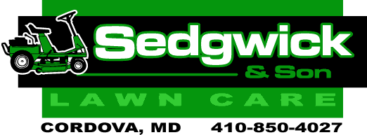
One of my contractors had me come up with a logo for his clients, and he all he specified was he wanted it oval, with grass and a sky, and the name inside...
So, how does this look? What would you change?
Thanks in advance...
-------------------- Mark Kottwitz Kottwitz Graphics Ridgely, MD www.SeeMySignWork.com -------------------------- Imagination is more important than knowledge. -- Albert Einstein Posts: 746 | From: Ridgely, MD | Registered: Oct 2000
| IP: Logged |
posted
Your illustration should portray more of a "lawn care" image. Try a more manicured lawn... maybe add some flowers or bushes. Add some color to the text and put more emphasis on one or the other (Sedgewick & Son or Lawn Care). I feel like they are competing.
just my 2 cents.
-------------------- Kelsey Dum Dum Designs Sherwood, AR 72120 501.765.2166 kelsey@dumdesigns.com Posts: 827 | From: Sherwood, AR | Registered: Oct 2005
| IP: Logged |
posted
too much sky....I would raise the lawn up to give it more space. Iwould use a display font for the owner's name and a sans serif for "lawn care" Maybe you could also try putting a tree in that hole below "sedg". Also, lower "Sedgewick" down to the optical center and decrease the size of "& son"...maybe try a different color for "& son" too. After moving the name to the center, try putting the birds and clouds around the top. You might also want to try changing "lawn care" to a dark green.
[ November 23, 2005, 01:03 PM: Message edited by: Wayne Webb ]
-------------------- Wayne Webb Webb Signworks Chipley, FL 850.638.9329 wayne@webbsignworks.com Posts: 7404 | From: Chipley,Florida,United States | Registered: Oct 1999
| IP: Logged |
posted
I think it is leaning too far in the direction of "realism" & that doesn't work for me. A more iconographic representation might be better.
Also the lettering seems overshadowed by the graphic. Try to make some real interesting lettering solution that could almost stand on it's own as a logo... then maybe bringing in some of the graphic requirements as a secondary component might help prioritize things.
posted
I think the letterstyle works ok for the main line, but goes stale after that. I am thinking a companion letterstyle might do the trick along with the other comments. Great start though!
edited cause I can't spell
[ November 23, 2005, 01:23 PM: Message edited by: Rick Beisiegel ]
""Good judgment comes from experience; and a lot of that comes from bad judgment" - Will Rogers Posts: 3489 | From: Beautiful Newaygo, Michigan | Registered: Mar 2003
| IP: Logged |
posted
I think one thing that most of us, including myself, fall into sometimes is letting the computer design for us. It's always a good idea to break out the pencil and paper for thumb quick thumbnail sketches, before turning on the computer. (I'm not suggesting that you didn't, just thinking out loud here, so to speak.)
I'd also suggest mixing up the typestyles a bit. A single font is monotonous and makes it a difficult job to lead a viewer's eye through a layout.
Vary font widths and weights, to aid in creating foreground, middle ground and background. The name of the company should almost always be the foreground.
I also agree that the graphic shouldn't overpower a layout, but compliment it. Perhaps a small graphic will work better. And without so much pictorial detail. You'll find that logo graphics work much better as abstract shapes. Too much going on in a graphic inevitably directs the view to look at it first, instead of the message, which is the name.
Lastly, the contour and dropshadow on the telephone number cause it to compete with the logo, which should be avoided.
Sorry, just some rambling thoughts on this design, several of which were already covered well or better by others here.
posted
I like Kelsey's point about the manicured lawn.... Perhaps try LAWN CARE in all caps... Bringing the name down lower might help. Why the black dots in the pic? Is it my monitor? To me, this doesn't look like a logo, but more like a sign. The chosen alphabet seems dated to me. As others have said, highlight one element not all. I'm just rambling too. Love.....Jill
Posts: 8834 | From: Butler, PA, USA | Registered: Jan 2001
| IP: Logged |
posted
Just playing around with it a bit, just to show the same thing from another angle. It probably sucks. But, I'm not getting paid, so it's allowed.
[ November 23, 2005, 06:39 PM: Message edited by: Don Coplen ]
posted
Hi Mark. There's a readability problem with many of these oval and/or circle designs. Placing your lettering inside a panel restricts your letter size. Here's an example.
Let's assume the image below is placed on a truck door. We'll also assume the oval size is 12" in height to fit your format, with is the truck door
How big is your main copy? A one inch high letter can be read from 25' away, but it isn't going to have much impact.
A logo has many uses. It has to work on vehicles, signs and printed medium. You can't always use the color version, so it has to look good in black and white as well. Shades and detailed pictorials can "clutter up" a logo making it hard to read.
I recommend a trip to the local supermarket. Look at packaging and learn why some designs have more impact than others. Examine your newspaper and yellow page ads. Notice how the simple bold logos stand out more than the others?
Dan Antonelli has written 2 excellent books on logo design. You can purchase them, along with other books and videos, from SignCraft Magazine. Use this link.
Hope this helps.
[ November 23, 2005, 11:00 PM: Message edited by: Steve Shortreed ]
-------------------- Steve Shortreed 144 Hill St., E. Fergus, Ontario Canada N1M 1G9 519-787-2673
posted
Mike, I know you didn't ask for redo's of your logo but looking at everybody else's interpretation of the job made me want to make my own.
To me, Sedgwick and sons is not the most important part of the message, LAWN CARE is. More potential customers will identify with Lawn Care than the owners name.
-------------------- Pat Whatley Montgomery, AL (334) 262-7446 office (334) 324-8465 cell Posts: 1306 | From: Wetumpka, AL USA | Registered: Mar 2001
| IP: Logged |
posted
I like Don's and Pat's renditions. Pat's could have some of the grass trimmed to make it even more effective. Geese trim grass, but they are way too slow, plus they $hit a lot.
-------------------- George Perkins Millington,TN. goatwell@bigriver.net
"I started out with nothing and still have most of it left"
quote:Originally posted by Patrick Whatley: Sedgwick and sons is not the most important part of the message, LAWN CARE is. More potential customers will identify with Lawn Care than the owners name.
Excellent point, Patrick. And redoing logos is a fun part of this website. It always reminds me of the Design & Price features in SignCraft.
posted
Great advice here, good point about oval layouts, Steve.
quote:Sedgwick and sons is not the most important part of the message, LAWN CARE is. More potential customers will identify with Lawn Care than the owners name.
This is a very valid point, but sometimes a very tough sell. Many customers insist that everybody knows them by name and that is how they will be recognized. But the folks that know you don't need your sign. The sign is for those who need your services. Getting past the vanity can be tricky.
-------------------- Joe Endicott NEXCOM (Navy Exchange Service Command) Signing Programs Specialist Virginia Beach, VA jeendicott@msn.com
"I want to be Stereotyped....I want to be Classified." Posts: 681 | From: Virginia Beach, VA USA | Registered: Mar 1999
| IP: Logged |
posted
With more lawn & less sky, could you try making the "Lawn Care" in a style that would resemble the letters actualy being mowed out of the grass, (or should I say mowed in the grass). I don't know how I would do this, but it would be cool if somebody who is better than I would try.
-------------------- Tom Bahr Custom Signs of St. Cloud, Inc. St. Cloud, MN 320-255-0588 tbahr@astound.net Posts: 71 | From: St. Cloud, MN | Registered: Apr 2002
| IP: Logged |
posted
Stevo, that's COOL! takes you up and over the Horizon to BETTER DAYS... with your lawn and yard looked after by Sedgwick & Sons!!
-------------------- John Lennig / Big Top Sign Arts 5668 Ewart Street, Burnaby, British Columbia, Canada bigtopya@hotmail.com 604.451.0006 Posts: 2184 | From: Burnaby, British Columbia,Canada | Registered: Nov 2001
| IP: Logged |
quote:Originally posted by Don Coplen: So, did we chase Mark off? Hope not.
No, I checked out the post on Wed. afternoon, and late yesterday afternoon, but not much time to spend on it.
Thanks for the replies guys. I really like the layout that Rapid Ray did. I guess it goes to show that you can have too much going on. (like in my layout)...
Thanks also to Steve for the link. I ordered both Logo Design 1 and 2 this morning...
I also like Stevo's layout, also...
-------------------- Mark Kottwitz Kottwitz Graphics Ridgely, MD www.SeeMySignWork.com -------------------------- Imagination is more important than knowledge. -- Albert Einstein Posts: 746 | From: Ridgely, MD | Registered: Oct 2000
| IP: Logged |


![[Cool]](cool.gif)
![[Smile]](smile.gif)


![[Wink]](wink.gif)


![[Bash]](graemlins/bash.gif)


 Printer-friendly view of this topic