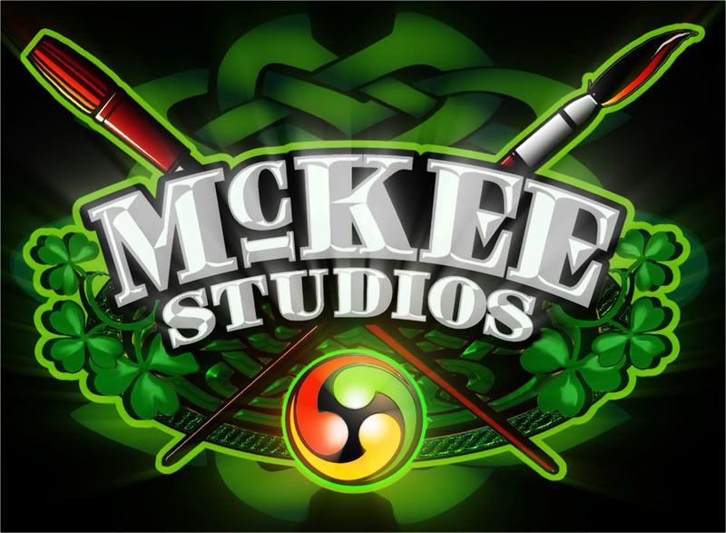
Hey Y'all Here is my new logo... Any changes or comments? If you can't tell I like Green.
Posted by Dawud Shaheed (Member # 5719) on :
Nice logo. I love the overall feel of it and the weight of it. The only thing I would change is the readability of the letters. maybe if you lightened up that hunter green a bit to be less of a contrast with the kelly green it would unify the letters more and make more of a contrast between the green and the black.
looks good, though.
Posted by Jillbeans (Member # 1912) on :
I would leave the subtle greens in the background and lose the green in the name. If you changed that to ivory or light grey with a white highlight it would look so much nicer. I'd make the white parts of the shamrocks in a softer green. Other than the colors, I think it looks real nice. Love....Jill
Posted by captain ken (Member # 742) on :
I think I would switch the colors up too, make the letters white for the most contrast and the contour outline a bit darker, maybe a lighter green
Posted by Lee McKee (Member # 3533) on :
[ May 23, 2008, 12:00 AM: Message edited by: Lee McKee ]
Posted by Dan Sawatzky (Member # 88) on :
I'd make the brown Celtic knots in the background the same dark green of the behind ones.THis would make a lovely 3D piece on the router!
-grampa dan
Posted by Neil D. Butler (Member # 661) on :
What Jilly Beans said.. the only other thing, and I know we all have an opinion, is that the name it seems a bit overpowered with all the background elements, if that is reduced in size say for a business card the name may get lost, but the edited version works much better, and I too think the brown is a little out of place as well.. see it's easy to critique when others have already done it. lol
Posted by Darcy Baker (Member # 8262) on :
Posted by Lee McKee (Member # 3533) on :
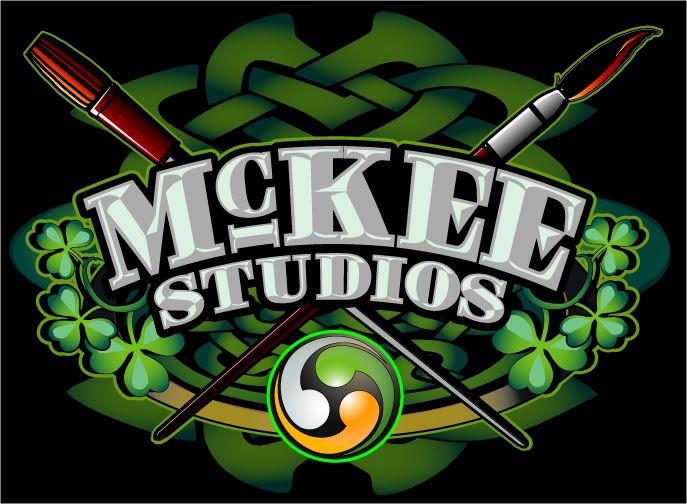
How 'bout now?
Hey Dan... Do you want that in any particular format or would an .ai do?
[ May 23, 2008, 12:10 AM: Message edited by: Lee McKee ]
Posted by Bill Lynch (Member # 3815) on :
I'd like to see the name in gold, more celtic, but still good contrast. Cool design.
Posted by Graham Parsons (Member # 1129) on :
I like it, but there's something about the green, the handle ends of the brushes and the round decoration that makes me think of a pool table...
Posted by Lotti Prokott (Member # 2684) on :
I like the second version! Posted by Catharine C. Kennedy (Member # 4459) on :
Saw your card on another post- very slick!
Posted by Todd Gill (Member # 2569) on :
Much better with the lighter text in your name....
But I'm not so sure changing the "small intestine" element from brown to green helped....I really think that it should be eliminated along with the weave at the top.... too busy in my opinion.
Posted by Jillbeans (Member # 1912) on :
Looks far better. Now I think I would make the celtic intestines in gold! Love....Jill
Posted by Lee McKee (Member # 3533) on :
Too Late... I already sent the cards to the printer. Thanks for your opinions Y'all. I think she is much better now that she has "evolved" a little.

![[Wink]](wink.gif)
![[Applause]](graemlins/applause.gif)