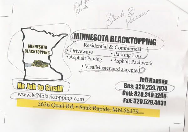
He was adamant that was his new logo. He'd made Bus. cards & everything already.
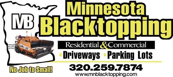
I tweaked it to hopefully read better.
Open to thoughts.
Posted by Jillbeans (Member # 1912) on :
This would really have looked neat on a black background. I'm not keen on the photo of the equipment....it looks "stuck on". I would have preferred a clip-arty looking sketched one. Your arrangement of copy is of course better than the original...but you BOTH spelled "too" wrong! Love....Jill
Posted by Richard Flint (Member # 6602) on :
Not sure about the logo part but the layout and colors of the text looks nice. It's clean and neat!
Posted by Patrick Whatley (Member # 2008) on :
What Jill said.
Posted by Todd Gill (Member # 2569) on :
What Jill said....and what Patrick said.
Posted by Jon Jantz (Member # 6137) on :
It's looking a hundred times better already...
The only thing I noticed after an intense scrutinization...
On the original, he has the weird little road that is *I guess* coming out of the little paving machine and balancing on it's edge... (a tough job for a paver, I would expect) Anyway, it's a weak effect that looks even more out of place behind your photographic paving machine.
I'd eliminate that.
Also, to me it would look better with one centered dividing bullet between Driveways - Parking Lots, instead of the inconspicuous yellow squares in front of the words.
Other than that, it's perfect, except for what Todd said. (Which is what Patrick said. (Which is what Jillbeans said.))
Posted by Dusty Campbell (Member # 4601) on :
It feels really cramped to me. Alot of condensed fonts and close kerning. The only thing that doesn't make my eyes hurt is the phone number.
What if you got rid of the machine all together and did something like this:
Just my 2 cents.
Posted by W. R. Pickett (Member # 3842) on :
...Good layout. ...I'd extend the black panels ends as far as the 'g" on the right, and under the "state' shape, on the left. Then sperad the containded copy somewhat. ...Personally, I like the 'paved" dash line concept, and I'd use it within the black panel, but stopping it where it comes close to the words. The copy is all lowercase, and I'd break that up by using upper case for the panels copy and the "No job too small" message.
Posted by Michael R. Bendel (Member # 5847) on :
Thanks for the comments. We (me & the client) eliminated the "road", Driveways & Parking Lots & The No job "TOO" small. Looks less busy.
I tend to like my letters kerned kinda tight from my hand lettering days. I'll take that under advisement.
![[Smile]](smile.gif)
