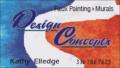
This is for a Business Card for my Daughter....My Brain has drawn a blank...Please do anything you like with this.... Thanks Shep'
Posted by CJ Allan (Member # 52) on :
Your brain has drawn a Blank.....????
I'm gonna have to come over there to see this for myself.......I have a hard time believin that on the internet......hahahahah
Posted by Jill Marie Welsh (Member # 1912) on :
I'm having trouble believing that you are drawing a blank too, Shep! You can draw ANYTHING! Here is what I came up with. I think it should have a marble background. I wanted a fox on it (a kind of pun on "faux") but all I could find was a frog. Love....Jill
Posted by Randy Campbell (Member # 2675) on :
Thats awsome Jill. Posted by Keith Myers (Member # 5051) on :
Posted by John Deaton (Member # 925) on :
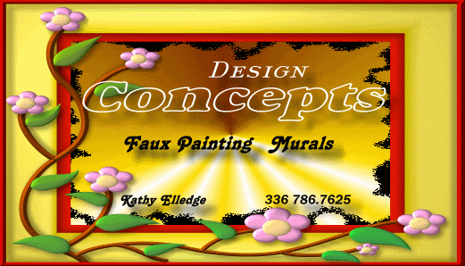
Just giving you some ideas Shep.
[ March 07, 2006, 03:21 PM: Message edited by: John Deaton ]
Posted by david drane (Member # 507) on :
Keith Myers winning so far!!
Posted by Brian Keence (Member # 1867) on :
Just a thought...
On Edit: I was trying to get the "Faux" look... guess it didn't work.
[ March 07, 2006, 09:17 PM: Message edited by: Brian Keence ]
Posted by Brian Keence (Member # 1867) on :
Sorry Arvil.... I'm still playing around.
Posted by Linda Silver Eagle (Member # 274) on :
What I love more than anything about Shep's idea is that the "p" in concepts points to "Paint"!
How about keeping that (tastefully, of course,) with these other ideas...it's priceless advertising strategy...the eye has been "hog-tied" at that point and that really is nice to see!
Shep, I love your version, I see a lotta love there! Posted by Frank Magoo (Member # 3950) on :
This is one of those times that illustrates why I must continue to learn PS and Corel; but at this moment in time, I don't know how to acomplish what I need to direct my critique of Shep's design...so'll I talk thru it and hopefully make my point just the same...
Shep, lot of nice suggestions, but only one, Jill's, if that's wood for backgrond on hers,, including yours, has any hint at all of "faux" effects, so if I wasn't "aware" of faux effects, I'd be left wondering what are faux effects and card wouldn't be of any help to answering that...sort of negates at very least, some worth of card... I don't see anything "wrong" w/your design, in fact, love the Bowley look, not many use it...it's an aquired taste, heheh.....but anyway, I'd illustrate the brush!!! Instant "faux effect"!!! (to illustrate it would require; wood, ferrell, and hair w/paint: a fair showing of faux effects if I may say so myself)... Then, substitute white background of upper right square w/mural(to illustrate your artist talents, using a mural as media)...starting w/enough white to effectly contrast the Des of Design, then start a fade to blues for sky and down towards bottom and tip of brush, do small, detailed little mural, say of mtn. village or whatever...I'd lean towards desert and cactus out here.... As I tend to underline almost everything as part of my style, I'd underline everything!!! heheh....also, if business is going to maybe lean towards a more personal touch in the future, and her name, like ours are as sign artists, all striving to stand out; I'd move her name off of bottom, move everything else down, and reinstall her name in possesive form, on top line, offset apportiately for balance....
Brian's first version was interesting for the use of country's colors...also, I saw that as coastline of US, as if veiwed from space; blue being the sea, white the surf(transition), the red as a city(if you look close enough, you can see the buildings and streets, go ahead and look, no ones lookn'...... Posted by Brian Keence (Member # 1867) on :
How about this one my wife Kathleen did.
Posted by Stevo Chartrand (Member # 2094) on :
Posted by Carl Wood (Member # 1223) on :
Jill's version werks for me - just thicken the outline on "Design" & I think that'll rock - - -Carl
Posted by Doug Phillips (Member # 5708) on :
Stevo, You have a short tut on the drop shadow blends? I think I know how you are doing them, but a step by step would be nice.

![[Applause]](graemlins/applause.gif)

![[Smile]](smile.gif)

![[Bash]](graemlins/bash.gif)
![[Cool]](cool.gif)