a couple of designs i am thinking of please help with layout sugestions i just hope they are'nt to large this is my first attempt at this
cheers Jason
Posted by mike norcross (Member # 3496) on :
Good one jason, i think you done a great job. All i would do if that were my design, is to put a demension on the main heading. 3-D effects,other than that is is great.
Posted by Marty Engel (Member # 3483) on :
Hi Jason,
First, let me state that I like the second Flame/Name layout better. I also like the flames and red background color of the design. To me, these two elements alone evoke the essence of sinister. However, I must ask what the meaning behind Sinister is?
Although the graphic and color of your design speak in terms of an edgy / gothic design business, the typeface of Sinister does not. Maybe you can try other type styles to fit in with the sinister / flame motif.
Secondly, I feel that the bottom of the card with your phone numbers is too busy. How would the design look if all the type was along the other axis - parallel with your business name?
Business cards can be tough to design. Especially when you try to create a nontraditional layout. So much to say so little space. Have you considered two-sides or fold-out possibilities?
Just my .02 (USD) cents... As of this posting, that is .034 Australia Dollars. What a bargain!
Good luck,
Marty
Posted by Amy Brown (Member # 1963) on :
I like the top design best. I think I would leave it how it is. Don't want to over do it!
Posted by Bob Stephens (Member # 858) on :
I have to agree with Marty about the typeface for the name. I can think of a few fonts that would lend themselves better to the name sinister. Otherwise, pretty good card.
Heres one that could work.
[ January 29, 2003, 09:28 AM: Message edited by: Bob Stephens ]
Posted by Ryan E Young (Member # 2325) on :
I agree and I really like Bobs font but I would leave the address on the bottom.
Posted by Mike Pipes (Member # 1573) on :
Now how can you promote graphic design when you can't even design your own flames for your business card?
I suggest you steal someone *else's* flames cause I sure don't appreciate you pilfering MY designs!!
**Edit**: OK, Jason emailed me and things are worked out now.. We're cool.. I was hot today having driven to Phoenix and back home today (on the road all day dealing with traffic - which I am not used to) so I overreacted not knowing the situation. Whew!
[ January 30, 2003, 01:34 AM: Message edited by: Mike Pipes ]
Posted by John Deaton III (Member # 925) on :
Uh oh. I sense a lawsuit in the air. Posted by Jason Bryant (Member # 3150) on :
Mike,
Sorry a friend gave them to me i will fix right now considered them deleted. I have learnt my lesson will not do such a thing again.
My humble apologies
Jason
Posted by Bruce Bowers (Member # 892) on :
I agree that font choice isn't exactly in character with the name. I like the font Bob used. I have a suggestion on my own...
Have fun!
Posted by Jason Bryant (Member # 3150) on :
Well i'm going to have another shot at a couple designs. Still not sure on the type face what do you all think.
Regards Jason
I don't think i have offended anyone this time but if i have let me know and i will fix.
Posted by Signs by Shawn (Member # 426) on :
Hi Jason,
The first impression I got was Natzi...Lose the cross, try using a swoosh mixed in with the flame in a different shade of gray...
Just my thoughts,
Shawn
Posted by Peter Schuttinga (Member # 2821) on :
Agree with Shawn, loose the cross. maybe extend the flame behind the lettering and let it fade out behind them. Your second sample has a prefered font style.
[ January 30, 2003, 02:55 PM: Message edited by: Peter Schuttinga ]
Posted by Jason Bryant (Member # 3150) on :
thanks guys
i like the second font better also, will get rid of the cross and see what looks like
regards jason
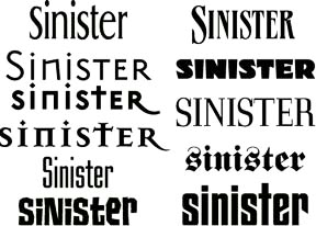
Posted by Rick Chavez (Member # 2146) on :
Here are a few "Sinister" looking fonts for you to chew on.
Rick
Posted by Mike Pipes (Member # 1573) on :
Think you need something like this, fits the "sinister" name a bit better than the other options, although it's not really all that sinister..
Posted by old paint (Member # 549) on :
my only question...why do you want to call your business "sinister"? it has nothing to do with art, signs, or graphics. 2nd you aint gona get any work from churches or "the god fearin folks" who go to them. and it dosent seem like the name is gona get you any business...only from the what used to hard core bikers here, and goth type kids.........just my thought..
Posted by Jason Bryant (Member # 3150) on :
"sinister" is just a name i liked. i guess i could of had "jason's signs" or similar but since this is only a hobby not my weekly job thought i might have a little fun with it. i am not out looking for goths riding harleys but if they want somthing done i'll do it.
Mike, i see you also post over @ sportruck.com what ride do you have, I'm doing a 63impala with full air down here in australia.
cheers jason
Posted by Bob Stephens (Member # 858) on :
Mike Pipes...cool stuff.
Jason, change the name to "Minister Licks" with a brush. Churches and god fearing folks have all the money.
Praise them all with your spiritual stripes and graphic voices from the heavens above.
Posted by Mike Pipes (Member # 1573) on :
Bob, thanks!
Jason, it's a '97 Mazda B2300, same thing as a Ford Ranger.. dunno if you have them down there in Oz or not. In the works is full air suspension although it's going to be unlike anything on the road (details are top secret - hehe).. I'm doing a completely new interior which will have no shortage of custom fabrication, utilizing lots of carbon fiber and neoprene (I'm a beach bum) with the audio system components hidden everywhere. I've started shaving the bodylines and all the seams and junk, but a voice in my head is telling me to scrap the body and build my own design.


![[Mad]](mad.gif)
![[Smile]](smile.gif)