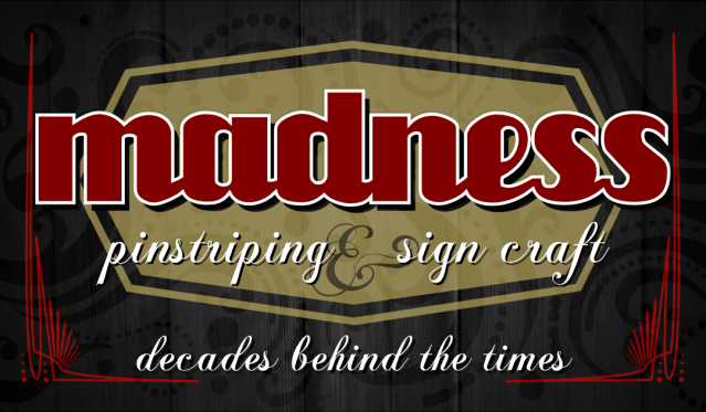
After all but a few of my business cards were destroyed due to a leaky trunk I decided it was time to come up with a new design and place an order. My design has changed, for the better, over the last few years, starting with a MS Paint design for the first round. I like what I have come up with this time around but I'm a little worried that it's too complicated. Could just be my paranoia but I know it has to show off my design skills and the eclectic person that I am.
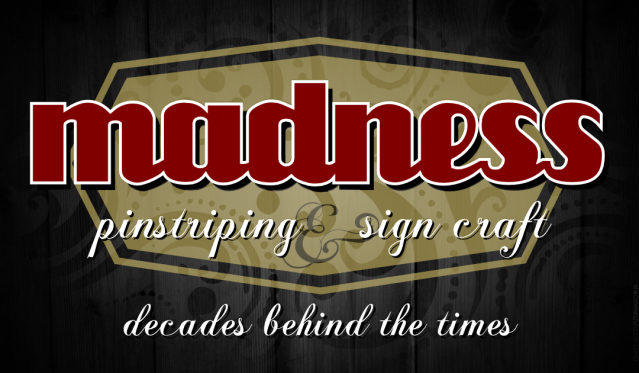
The cloudy white area is actually going to be clear UV gloss. (Not white as seen)
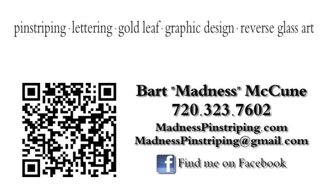
The back side is all business. The QR code, if scanned with a smart phone, will take you to my online Picasa portfolio.
(I decided if I were going to ask anyone, I would ask the professionals )
Posted by Dan Sawatzky (Member # 88) on :
It looks good. I would keep the varnish out of the primary lettering.
-grampa dan
Posted by Dale Feicke (Member # 767) on :
I think it's pretty cool, Bart.
I like the transparent effect on the main lettering, and I particularly like your little saying on the bottom ....clever.
Only thing I might suggest is make the "decades behind....." the same color as the "Pinstriping". It needs to stand out too.
Posted by Bart McCune (Member # 21369) on :
I was actually thinking the same thing. Not sure if I want the lettering to be all glossy or all satin.
Posted by Bart McCune (Member # 21369) on :
Thanks Dale, I'll make the changes now.
Posted by Sean G. Starr (Member # 1549) on :
We are all about the older traditional side of what we do and ive been considering going towards old offset style printing and getting away from digital to be more in line with that. Your design is cool, but what about maybe using a decades out of date style of printing your cards? Just an idea, our cards are digital print too, but im thinking of making the change on our next batch...
Posted by Bart McCune (Member # 21369) on :
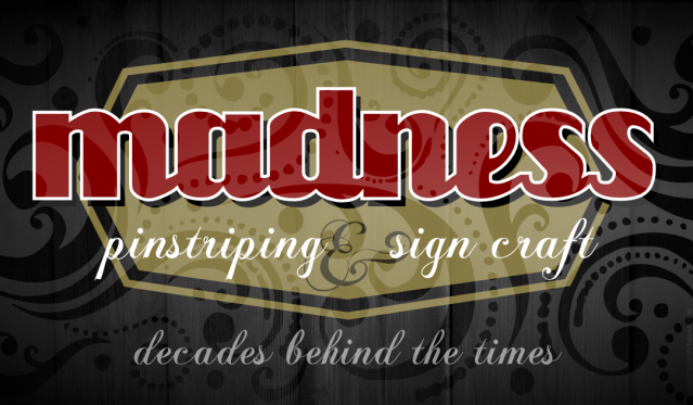
Revision
According to the website "Premium Cards are printed on an offset press." Not too sure what that means...
Posted by Don Coplen (Member # 127) on :
I like it!
The only change I might suggest is not mixing scripts.
You've done good, though. The hardest card we'll ever design is our own.
Posted by Bart McCune (Member # 21369) on :
aside from the ampersand the script is the same. I really wasn't pleased with the one that came with the script font so I found one that was a little more embellished.
Posted by Bart McCune (Member # 21369) on :
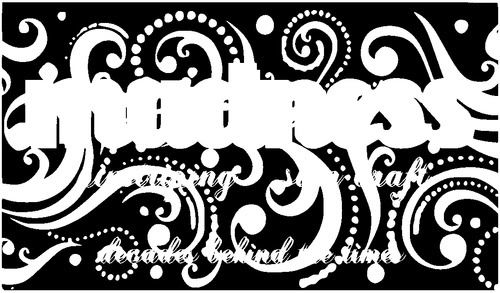
Just to show you guys how the UV spot coating file is sent over.
Kinda just looks like a complete mess without the card design behind it.
Posted by Sean G. Starr (Member # 1549) on :
Im probably using the wrong terminology, I just meant printing it traditionally and not full photo style 4 color printing. I will retreat to my fantasy vintage world now...
Posted by Bart McCune (Member # 21369) on :
I would if I had a press...
I'm gonna go browse ebay...
Posted by Don Coplen (Member # 127) on :
madness and pinstriping are the same script?
Posted by Dennis Kiernan (Member # 12202) on :
I dont think the ampersand looks centered. And on the back the shadow on the type makes it look like it was printed out-of-register. Maybe it's because the type is a small size.
Posted by Bart McCune (Member # 21369) on :
Sorry don you're right, i've never thought of the other font as a script font, way too "block". But technically you're right.
I moved that ampersand around quite a bit to find a place where it looked right. That's what i settled on, everywhere else it looked awkward. I'll work on the back of the card to make it more pleasing to the eye, I see what you're talking about there.
Posted by Bob Sauls (Member # 11321) on :
Bart I love what you've done. Would you send me one of your cards when they are printed, Please? www.saulssigns.com Posted by Bart McCune (Member # 21369) on :
Uh sure, no problem mind if I ask why?
Posted by Curtis hammond (Member # 2170) on :
On the qr side.. Like me on Facebook and get a $5.00 credit on your next job.
Posted by old paint (Member # 549) on :
its a good card for a "sign guy." i dont pickup on PIN STRIPING......
Posted by Ian Stewart-Koster (Member # 3500) on :
I'd remove the grey shadown from the back side-I don't feel it aids legibility there. The ampersand also looks offcentre to me too...but because of the extended swirl, I'm not sure what you can do to make it look right.
I'd possibly be inclined to put ~ (a tilde) on either end of the 'decades' phrase.
Posted by Todd Gill (Member # 2569) on :
Bart - my opinion is that your 'revision' is nice, EXCEPT for the two bottom lines of script.
Using a thick/thin script over an elaborate filigree background is [generally] a visual design mistake.
OP is correct in saying that he isn't picking up on the 'pinstriping' line of text.
I would have used some form of a sans-serif block for that line....
as well as tucking the 'decades' line under the 'pinstriping' line in a smaller version of the same sans-serif font.
Glad to see you ditched the background filigree pattern out of the Madness, and minimized (via vignette) the intensity of the background filigree pattern.
But pull the 'decades' line off the floor of the card... it's a 'floater' that draws attention away from the more important text above it.
Posted by Michael Clanton (Member # 2419) on :
I kinda like the effect of the first one better, even thru the word "Madness" the second one, the effect is pretty much lost (of course it will look different with the gloss)
on the back- lose the shadows on the lettering- it makes it look cheap (overused effect in Powerpoint or Word) not needed for flat 2D design like a card
Posted by Bob Sauls (Member # 11321) on :
Because I might need some one to paint me a sign.
Really I just like the design and I wish to see the card's coated/uncoated result in reality not in just a computer screen comp. I think that is a very creative approach to a card.
I once designed a business card for a house painter and made one side look like a paint swatch from out of the store rack.
Posted by Bart McCune (Member # 21369) on :
Here we go.
I've always been told to never sell myself short, Never offer a coupon unless your selling groceries.
The word "Pinstriping" is on the card 4 times. I think the message will come across.
The drop shadows on the back are going to be removed. I agree with all of you.
The ampersand stays, Its more of an object in the background that a piece of text to me. That is also why I didn't exclude the UV Clear over it like the rest of the text.
The script font stays, i think it adds elegance to the card.
The filigree isn't actually in the background, I used a gradient white to represent a reflection. It will be a spot UV coating that will be consistent over the whole card, no fading to the edges.
Bob I'll make sure to send a card when I receive them.
Thank you everyone for their opinions. You've helped a lot.
Posted by jack wills (Member # 521) on :
I would say: "Ahead of my time"
Might make a little more sense as a promo...
Posted by old paint (Member # 549) on :
what i was making referance to as..."not picking up on pin striping".....not that you had the "word" but i see NO PIN STRIPING on the card........you need to look at some of the pin strippers on www.pinheadlounge.com or ask them for their business card...nice card madness signs....
[ December 04, 2011, 07:31 PM: Message edited by: old paint ]
Posted by Joey Madden (Member # 1192) on :
here's my card, the real card has my phone number on it and although it doesn't say lettering I have been known to scribble once in a while.. Posted by Bart McCune (Member # 21369) on :
Posted by Rusty Bradley (Member # 6938) on :
Joey...I like your idea of including a pic of yourself on the card.
Posted by Dave Grundy (Member # 103) on :
Bart...I like the addition of the pinstripes at the edges...That reflects what you do.
But, like others, I find that darkened ampersand, with it's shadow, to be really off kilter.
Maybe just lose it or really make it way smaller and the same colour as the rest of the text?
Posted by Joey Madden (Member # 1192) on :
Bart, I too like your pinstripes at the edges on the card and I also thank you for using my dots.
BTW, I prefer not using script of any kind if not just for its simplicity. All my cards were simple to read which hadn't anything to do with my quality or prices as many can tell you or you can check out my portfolio's link below..
Posted by Bart McCune (Member # 21369) on :
I'm a big fan of dots. Get requests for them in my work all the time.
Posted by John Byrd (Member # 825) on :
I like the idea, I like the little code thing on the back also. I'm a little bit illiterate when it comes to the latest new thing. How do you generate one of those and make it work?
Posted by Mikes Mischeif (Member # 1744) on :
I'll chime in. The red pinstripes now compete with the red "madness". MAybe black for the pinstripes to drop then in to the backgroung or eliminate them altogether. Pinstriping & Sign Craft deserve thier own rectangular panel to pull them to the forefront. I'm thinking white with gray letters. You could pull a small red outline on that panel if you eliniate the pinstripes.
It does look nice. Mike
Posted by Bob Sauls (Member # 11321) on :
Drop the stripes, Sir.
Posted by Bart McCune (Member # 21369) on :
Hahaha. Can't please them all Posted by Dan Beach (Member # 9850) on :
quote:Originally posted by Mikes Mischeif: I'll chime in. The red pinstripes now compete with the red "madness".
I like the pinstripes, but I agree with their close proximity to the madness, it makes them look out of place.
If they went behind madness, I think that would get it.
Posted by George Perkins (Member # 156) on :
Compulsive graphic relativity!
Posted by Sonny Franks (Member # 588) on :
Just to confuse the issue a bit more, how would the ampersand look in red and slide the stripes (which I like) a little further towards the edge so "madness" can breathe? I'd also go with caps on the P in "pinstriping" and S in Signcraft - and make that one word instead of two.
Although we're putting our group 2 cents in, I think we'd all agree this will be a very effective card, no matter what you do. btw, your striping is very impressive.....
Posted by Bart McCune (Member # 21369) on :
I've actually made the stripes a darker red so they blend into the background a bit more. They're there because of bleed and moving or changing the text will make me change the uv spot file, which unfortunately i've flattened and turned into a jpeg already without saving the vector file (stupid i know)
Unless i work up some ambition to change it sometime this week, "it is what it is". Im honestly really happy with what it is now.
Lot of work for a 3.5 by 2 inch space...
Thanks for the compliment on the striping.
Posted by Don Coplen (Member # 127) on :
Back before the letterville chat room was disbanded, in favor of Skype, we often did "live" critiquing of layouts. One would send his/her design in vector format to whoever in the chatroom wanted to play.
From there, we'd not just make suggestions, but literally show a suggested font or border or color change.
Lots of fun, educational.... But gone the way of the buggy whip.
Posted by Neil D. Butler (Member # 661) on :
It's A lot better now imho, but Madness looks to be forced between the stripes, maybe reduce the size of Madness just a smidge for Breathing space, and Yes you can not please everyone.lol don't ya just hate.lol
Posted by Deri Russell (Member # 119) on :
Wow, all this help, aren't you glad you asked????? LOL
Posted by Bart McCune (Member # 21369) on :
It definitely came out better after all the advice... but its a lot to take in lol
Posted by Bart McCune (Member # 21369) on :
They're here!
Posted by Dan Sawatzky (Member # 88) on :
Looks good Bart!
-grampa dan
Posted by bill riedel (Member # 607) on :
I am with Sonny, but can't understand why no one mentions there is no stroke on the s in sign. I think caps on the first letter would do a lot for the script. Signcraft is a better choice. Bill
Posted by Preston McCall (Member # 351) on :
My advice is to listen to all of the suggestions and then, just trust your own instincts. Only you really know what you need. There is no right or wrong, just your own reaction at staring at it day after day. Change is good. Feedback is good. Your gut instinct is better.
I posted some of my web logo ideas a while back and got all kinds of suggestions that I took in many different directions. Some good and some did not make a whit of sense. It did make me really think about it and decided to use many different ones on every section of my site. Do people come to me because of my logo? No. They 'come' to me because I apply intense laser magnetic energy toward their wallets! It all boils down to selling. BZZZZZZZ
![[Wink]](wink.gif) )
)
![[Smile]](smile.gif) mind if I ask why?
mind if I ask why?