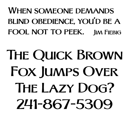
In the Jan/Feb 2001 edition of SignCraft (pg 79), Mark Josling shows an Optima-based type style that I've been wanting to use ever since I saw it. I wish I knew how to letter it by hand, but since I don't, I had to settle for making a font out of it.
Some of the letters needed tweaking to give a consistent look to the font. I also added numbers, punctuation, and a set of small caps. Is there anything that still needs work?
These alphabets are published in the magazine with the idea that people are going to copy them and make use of them. I don't see any mention of restrictions or the expectation of remuneration. Therefore, I feel completely comfortable making a font for my personal use. But, making the font available to others, with the possibility of profit, is a different story. All sorts of ethical questions spring up. Any thoughts?
Posted by Checkers (Member # 63) on :
Hiya Russ, I like it! Fonts can not be copyrighted because it would be considered a restriction on free speech. However, the electronic data or program coding used to create a font is copyright protected. I think this is part of the reason why you see many identical looking fonts with different names. While a freebee would be nice, I don't see why you wouldn't want to offer it up for sale on one of the many font sites. Although you won't get rich, you should be rewarded for your efforts.
Havin' fun,
Checkers
[ July 26, 2008, 04:44 PM: Message edited by: Checkers ]
Posted by jack wills (Member # 521) on :
Go...speed racer,Go!
Very Tasty.
Posted by Rick Sacks (Member # 379) on :
Mike Stevens used to use his modified optima and I don't think I ever paid much attention to it until I saw how he was using it. I like what you're doing Russ.
Posted by Michael Gene Adkins (Member # 882) on :
To all your questions:
You have nothing to worry about! (unless the creator doesn't like you bouncing his name around!) A different optima is fine to me. Makes for a good logo quality font. My Rager Hevvy saw tons of happy downloads, so why not do the same with this one? I probably will wait awhile before I even try to sell it.
If there is an issue of ethics, give away a limited version and put a full-blown commercial version on myfonts. That way no one has to pay for it if they don't want to, and the freebie isn't the full monty anyway.
FYI: did you know that some ad agencies won't use a font if they can't buy it? It's true. And it's all because of legal/piracy issues. I've sold more than a few paks where I had to include a note to the company that after buying it they were free to do whatever.
now .... you gotta do a lowercase ... it is the internet age after all. Plus you need an alternate uppercase "M" so you won't have issues kerning that UC "A" to it all the time. Straighten the sides like the N and yer good.
Plus I'd be glad to help with the kerning or any sidelines cheerleading if ya need it.
overall balance of all the characters looks pretty good. numbers looking good too. The 4 is a little different, but I like it!
Posted by Curtis hammond (Member # 2170) on :
collected from reliable sites.
A typeface is a set of letters, numbers, and characters, who are related by repeating design elements.
A font is the computer file or program that is used to represent or create the typeface
Committee does not regard the design of typeface, a defined, to be a copyrightable...
The U.S. Copyright Office holds that a bitmapped font is nothing more than a computerized representation of a typeface, and as such is not copyrightable..
scalable fonts are, in the opinion of the Copyright Office, computer programs, and as such are copyrightable: This expression, assuming it meets the usual standard of authorship, is thus registerable as a computer program. This means that the shape defined via a series of numeric code is a computer program. However the inage itself is not.
Thus the confusion that fonts are/are no copyrightable.
Posted by Wayne Osborne (Member # 4569) on :
Nice work Russ- Why not contact Mark..I'm sure he'd be pleased to hear from you - and want a copy at least!
Looks good, Russ. I would have to slide the vertical downstroke of the 4 slightly leftwards along the horizontal bar and fiddle the Q, but that's just personal preference, it's fine as it is.
Posted by Todd Gill (Member # 2569) on :
Russ - I like it.... I too thought/think that something isn't quite "right" with the "4".....but other than that, it's pretty neat.
To me.... it gives the perception of a thick/thin carved look. I can see this looking really nice guilded on an HDU or blasted sign.
I agree with Michael on the need for lower-case.
I HATE coming across fonts I like, and then finding out they only have upper-case. Very limiting to me.
Looking good.... keep us posted as you progress! Nice job.
EDIT: Russ, looking it over again, one other character bugs me just a *little*......the upper-case "R."
It's probably just me - and a personal preference thing - but I've never been fond of upper-case "R's" that have very compressed-looking upper halves ( you know, the loop part on the top) and long legs. Any merit in opening that up a little... maybe to the size you have on the upper-case "P?"
That's all... minor quibble.
[ July 27, 2008, 08:50 AM: Message edited by: Todd Gill ]
Posted by Michael Gene Adkins (Member # 882) on :
Todd,---
I hear you on the R. The A has the same thing going on. None of that bothers me too much, but I know that my customers would start to squirm if they saw it.
Thankfully Russ can fix that with alternate characters.
We're just giving him a ton of work to do, aren't we!?!
And while everyone has mentioned the 4, I would leave it. 4s are always tricky little beasts as they don't share their shape with any of the other numbers, but I think Russ is good to go with this one. Nice to see something different.
Russ---yes, contact Mark--as suggested above. Collaboration is a good thing. I'm currently helping a Letterville resident on a font he digitized, and with his blessing I'll be showcasing it for him soon here, so maybe you and Mark should do the same.
Posted by Randy Campbell (Member # 2675) on :
Nice Russ;have you used that disk I sent you and if you did is it any good?
Posted by Russ McMullin (Member # 5617) on :
Wow, thanks for all the great replies. You are such a talented group, and it helps me to know what other people think. Michael, I wonder if we could chat on the phone sometime.
I had sketched up a rough lower case alphabet, but then I got an email from Mark Josling. I'd rather use his than mine, so it looks like we will be working together to make this font happen.
I actually like the quirks in the alphabet, like the A and R, but I can understand the need for alternate versions of those characters.
Randy, I did install the disk, and it works. I haven't really learned how to use the software yet, other than to convert files. Someday I will. Thanks so much for that. I certainly owe you a big favor.
![[Smile]](smile.gif)
![[Wink]](wink.gif)