 A
Letterville Step By Step
A
Letterville Step By StepRecreating My Logo
By Don Coplen
 A
Letterville Step By Step A
Letterville Step By StepRecreating My Logo By Don Coplen |

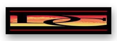
Several people have asked me how I did the sunset effect for my logo. It's really alot easier than it looks, and seems like a good subject for my second step-by-step.I started with my initials in University Roman. To get the look that I wanted, I stretched the type, then intertwined them. The next step was to "unite" the letters. (In some programs, this is called "welding".)
After creating my initials, I drew a rectangle to be just slightly smaller than the letters, so that the letters would overlap it, and created a gradient. Selecting both the letters and the rectangle, I went to Illustrator's pathfinder palette and clicked on the "minus front" command. This deleted the letters from the rectangle, leaving only the silhouette of them against the rectangle.
Now, I select the entire rectangle, or what's left of it, and make a "compound path". What a compound path does is make a group of shapes act as one. Don't confuse this with "grouping", which only allows a group of shapes to be selected as one.
While the rectangle is still selected, "copy" and "paste in back"; and then lock the bottom rectangle for now. This will put an copy of the shape directly underneath the top one, and locking allows me to work with the top copy without disturbing what's beneath.
The next step was to select a custom brush from the brush palette. I chose the "charcoal" brush. After first drawing a curvy line with my pen tool, I clicked on the charcoal brush icon to turn the line into a brushstroke. Double clicking on the same brush icon in the "brush palette, I adjusted the stroke to my taste by checking the "proportional" box and changing the width to 20%. By checking and unchecking the "proportional" box, you can see the preview change on your original line in the Illustrator document. Once it was like I wanted, I applied the brush stroke to my line.
Although the brush stroke that I now had over the rectangle design would print just fine, I needed to manipulate it one more time. To turn the brushstroke into an "object", it must first be "expanded", by going to the menu at the top of the screen and selecting Object>Expand. After expanding, I go to Object>Path>Cleanup to get rid of the original line that I used to create the brushstroke. While the brushstroke is still selected, I make it into a "compound path", as I had done earlier with the rectangle.
Again, making a number of objects into a compound path makes them act as one object. The next step will not work if the objects are merely grouped.
Selecting the rectangle (which, you'll remember, is also a compound path now) and the brushstroke, I again go to the Pathfinder palette and click on the "minus front" command.
I applied a yellow to red gradient to the resulting shape, going from bottom to top; then unlocked the bottom rectangle (remember the bottom rectangle? it's still there! haha) and applied the same gradient, but top to bottom.
All that was left to do was to place a black rectangle around my sunset design, and then throw in a couple red lines, and it was done.
I hope you'll find this step by step useful. It's an interesting effect that takes only a couple minutes to do.

|
Copyright © "letterville.com The Letterheads Website
[ Letterville | Join
Us | Bulletin Board | Events
| Letterville Merchants | More
Step-By-Steps ]