 A
Letterville Step By Step A
Letterville Step By StepMatching Printer Output to a Color Sample By Don Coplen |
While I was working in the screenprint industry as a graphic designer, it was important that the colors of my concept art printouts matched as closely as possible the vinyl colors that were represented. I regularly added new color matches to my Illustrator palettes as new colors of vinyl were added to inventory. Following are the steps that are involved in matching colors to your printer. I am using Adobe Illustrator for this tutorial, but since the only two tools involved are the blending tool and the CMYK color palette, the process I describe will be universal to most design programs.
Throughout this tutorial, I will be referring to three color samples:
- 1. The target color, which in this case is a color chip from One Shot's new color brochure, but could just as well be a swatch of vinyl.
- 2. The onscreen color, which is the color squares drawn onscreen.
- 3. The printer swatches, which are the printed samples. I suggest that you use the same paper that you intend to use when printing out designs, and a resolution of 300 dpi.
Step 1 Creating an estimated onscreen match of the target color.
Begin by creating a new document File>New, and drawing a square. We will be estimating a match of the target color in this step. Educated guesses are all that is needed, as all we need here is a color match starting point.
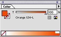
Only basic color knowledge is required to estimate a match of the target color. (Red + blue = purple, yellow + blue = green, etc.) Begin by sliding to 100% only one or two CMYK values that you decide will be required. If you are matching a red, you will begin by sliding magenta to a value of 100%. If you are matching orange (as in this case), you would begin by sliding the magenta and yellow values to 100%.
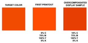
Comparing the onscreen color with the target, decide if any of the CMYK values need to be corrected. For my Orange target, the onscreen color is way too red. So, I lessen the magenta value, finding that my orange is reached at 70% magenta. There is no reason to move the yellow value.
In step 1, keep in mind that we are only estimating a color match. The precision part of the match will ultimately be done by your computer. (Relieved to hear that?)Print the resulting square.
Step 2 Adjusting CMYK values to compensate for differences between the printer test swatch and the target color.
Make a copy of the onscreen color and place it at opposite ends of the workspace print area. We will be working only with the copy in this step of the process. We will not touch the original onscreen color square in this step.
(In the next step, we will be "morphing" a stepped color blend between the first color that we printed and the copy that we're about to adjust in values. So, in this step, the object is to overcompensate for the differences between the first printout and the target, which will cause our target color to fall somewhere between these two in Step 3's blend.)Unless your original printer test print is a match for the target, which seldom happens, you will notice in comparing the printout with the target that the printed color needs more or less of a hue. It may also need to be dulled or brightened, darkened or lightened. To dull a color, add it's compliment. To brighten a color, subtract it's compliment. Often, you can add or subtract black to darken and lighten a color. And of course, if your printer swatch has too much or too little of a color (for example, too much red), adjust that CMYK value accordingly
It is very important while compensating CMYK values in this step, that you overcompensate, by moving the slider 3 to 5% more in the same direction, than you think it needs. This will help ensure that when we do the blend in Step 3 that the match will fall between this edited color square and the original square that we had earlier printed.


