|
A
Letterville Step By Step |
||
|
Ok Gang, This is going
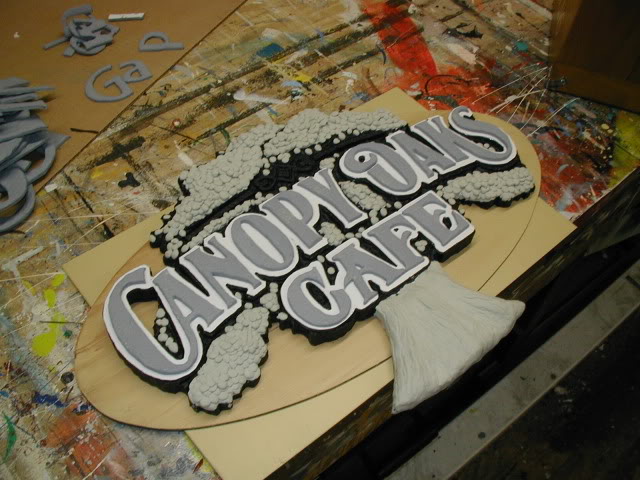
to be a step by step with some photo gaps. 2 years ago I was asked to give
an estimate to dress up the Westminster Oaks' assisted living hallways these
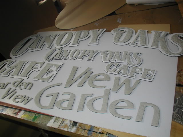
were to include quaint signs to Identify the 4 different corridors as
"Street" signs and signs for 2 different Cafeterias. Even though I have done
other similar projects for them in the past. see
http://www.saulssigns.com/index.cfm?cat=clients&subcat=Westminster
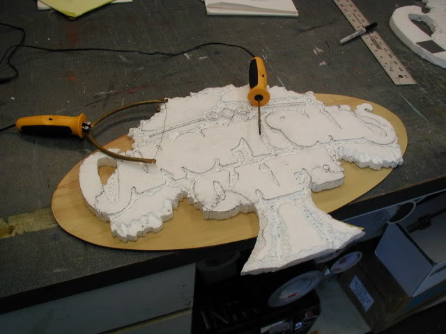
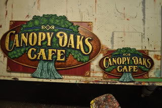
They were a bit taken back by the prices this time. I knew these would be stepped up design wise and be multi-paneled if not fully dimensional. They did them in stages over several years for budgetary reasons. They never would pay for full dimensional. Sometimes there are jobs that would be nice to do for our own reasons: Learning new medias and techniques. We have to create high end samples if we are ever going to sell them. Might as well get paid partially to do them. On the Canopy Oaks Cafe sign and on the up coming Garden View Cafe, I'll be making a smaller version of each for my own wall. Now with the history behind us we move on. My objective was to wow them and others with what is possible. Knowing that I would be taking a financial hit in the hourly rate department I wished to used shop scraps whenever possible. Why not let past clients pay for the materials for this project. The only materials that I would purchase would be. $8 worth of ESP foam, 2 Cans of spray paint and 4 machine screws with matching nuts. I began by transferring the letters drawn by my plotter on to Poly-metal with a ball-point pen and carbon paper. I then laid the metal on a piece of 1 inch thick Styrofoam sheet. I then placed an 1/8 inch router bit in my plunge router and cut out the Poly-metal letters by hand. The foam sheet was just a soft material to suspend the Poly-metal on for routing. Although this worked well as Sam Staffan suggested my hand routing skills did no justice to Dave Correll's Signmaker and Stone Cutter fonts.
I cannot tell you with enough enthusiasm the hiding benefits of adding the texture. My rough routing went away and the letters were just plain more interesting. My next step was to join two pieces of foam together edge to edge. Because I did not know what type of adhesive to use on this fragile product I went with duct tape a seam on the front and one on the back. because of the layout I could trim the tape and remove it from between my raised letters. The foam was to be used mainly as a build up or filler for the clay. I was relying of the MagicSculpt to harden and create a durable shell. But first some depth and detail, would have to be added to my foam base with Hot-wire hobby tools.
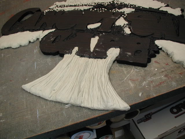
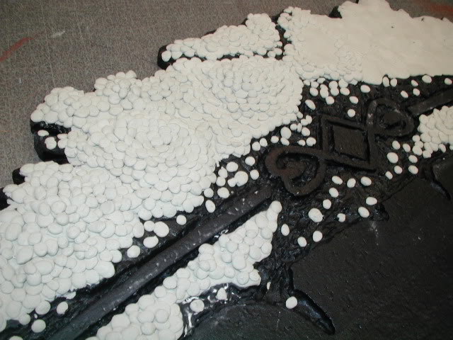
Black bed liner spray. Thank Heavens I did a test it DID eat the foam. I Painted 3 heavy coats of latex primer on all surfaces before spraying on the coating. It did pock the foam even through the primer, so I kept the coats very light with a lot of curing time between about 3-4 coats. Would the Magic Sculpt or latex paint stick to this coating? I would know soon enough. Next a layer of Clay was spread on to the coated foam in strategic areas. Before a more detailed layer of Magic Scuplt could be applied.
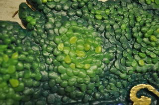
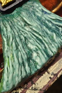
On the Oak itself I began with a very dark blue-green. I would blend the leaf masses to enhance the depths of the boughs. By adding brighter and brighter hues of grass green to the wet layer below a nice gradient was achieved. The texture of the individual leaves actually helped. Finally I spiced things up by going a bit brighter on specific leaves to make them pop. It was a matter of higher contrast here and there.
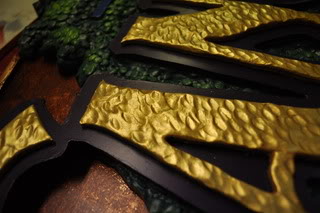
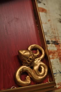
It is coated with a cheap metallic gold spray paint acquired at a Family Dollar Store. The Poly-Metal it is resting on was painted with an ugly lipstick pink color with a thin coarse brush stroking of a brownish red for antiquing both latex. It also sports a PVC trim frame sprayed with the same metallic gold paint.
Now in the Sunshine!
Thanks for taking time to follow this project. I'll let you know what they think soon. Oh by the way, that good looking man is standing beside the smaller sample piece. |
||

|
||
|
[ Letterville | Join Us | Bulletin Board | Letterhead People | Merchants | More Step-By-Steps ] letterville.com The Letterhead Website |